Manual Redesigns Obama

Manual: Obama Foundation Brand Identity (Copyright © Manual, 2025)
Originally designed for Barack Obama’s 2008 presidential campaign, the Obama logo has grown beyond politics. It has endured as a symbol of hope and, since 2014, has served as the official identity of the Obama Foundation. Recently, the Foundation partnered with San Francisco–based studio Manual to reimagine the brand.
The Obama “O” logo, symbolizing hope and progress, was originally designed by Sol Sender for the 2008 presidential campaign.
I had the chance to attend a presentation about the rebrand during San Francisco Design Week, where the team from Manual shared their process and insights behind refreshing such an iconic identity.
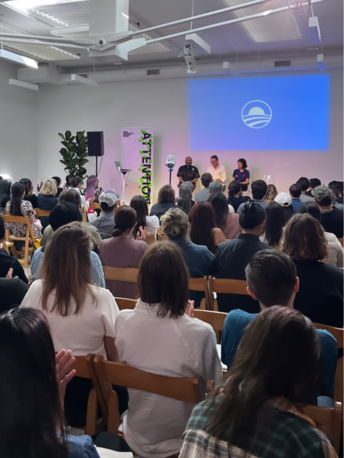
Hashem Bajwa from the Obama Foundation joins Tom Crabtree and Vanessa Lam from Manual to discuss the evolution of the Foundation’s visual identity. I’m in the audience wearing a blue shirt and white trucker hat.
Manual opened their presentation with a look back at the history of Obama’s visual identity. They mentioned the book Designing Obama—which I’m lucky to have a copy of—that highlights how art and design shaped the campaign’s message of hope and unity. It features work from Shepard Fairey, Lance Wyman, and David Carson among other artists. It’s a great book if you want to learn more about the creative work behind Obama’s 2008 campaign.
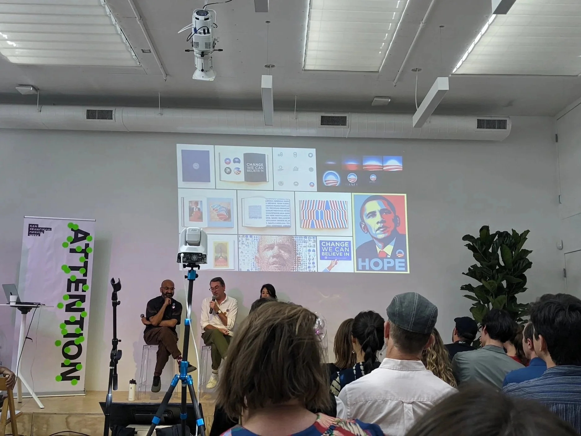
The Manual team opens their talk with a look back at Obama’s 2008 campaign visuals and the origins of the iconic logo.
Tom Crabtree, founder and creative director at Manual, spoke about how they honored the legacy of the original logo by making only small visual tweaks and adapting it for one-color use. The wordmark now uses a single weight, giving “Foundation” equal emphasis with “Obama” to show that the work represents a collective effort, not just the Obamas.

Manual not only kept the iconic rising sun logo but also retained the Gotham typeface—designed by Tobias Frere-Jones in 2002 and made famous during Obama’s 2008 campaign. They refreshed it by adding Gotham Condensed Bold, a stronger, more energetic style that brings new life and purpose to the brand.
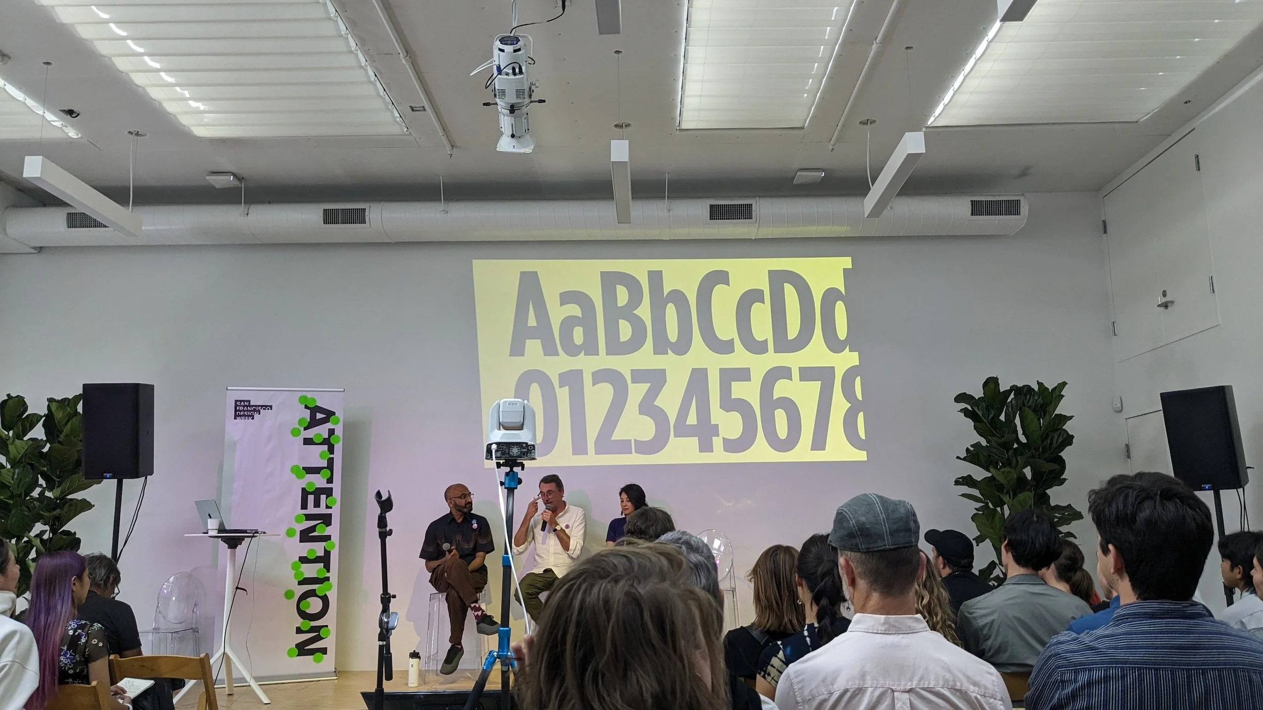
Hashem Bajwa, Tom Crabtree, and Vanessa Lam discuss typography choices in the Obama Foundation rebrand during San Francisco Design Week.
Manual talked about how, over time, the Foundation’s look had gotten messy, with different programs creating their own takes on the logo. Each small tweak added up, making the brand feel inconsistent.

Manual discussed the inconsistency across the Obama Foundation’s sub-brands.

The redesign creates a clear, unified system with logos available in both horizontal and vertical formats.
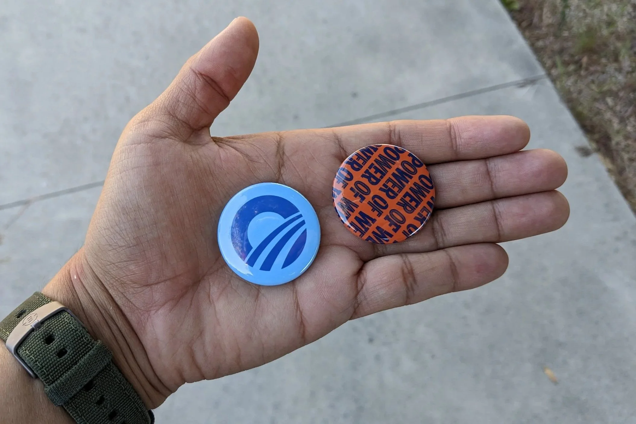
Some branded merch from the event.
I left the event with a couple of Obama buttons and a ton of inspiration. Manual refreshed a historic identity without losing its strength, creating a consistent system for the future. It was great hearing the team share their process and the ideas behind updating such an iconic brand.