Family Health Care Network
A brand identity for a nationally recognized community healthcare provider committed to quality care for all.

Brand Strategy: Sean Tambagahan

Inspired by the ‘wave’ motif from the original logo, the new FHCN symbol has been created for a modern world, while staying true to it’s heritage.
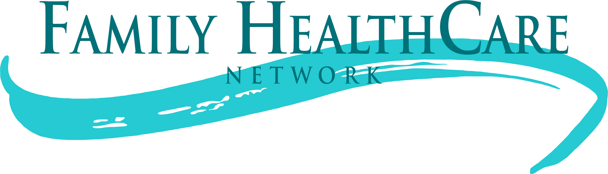
Original FHCN logo with the brushstroke ‘wave’ design.
New Logo


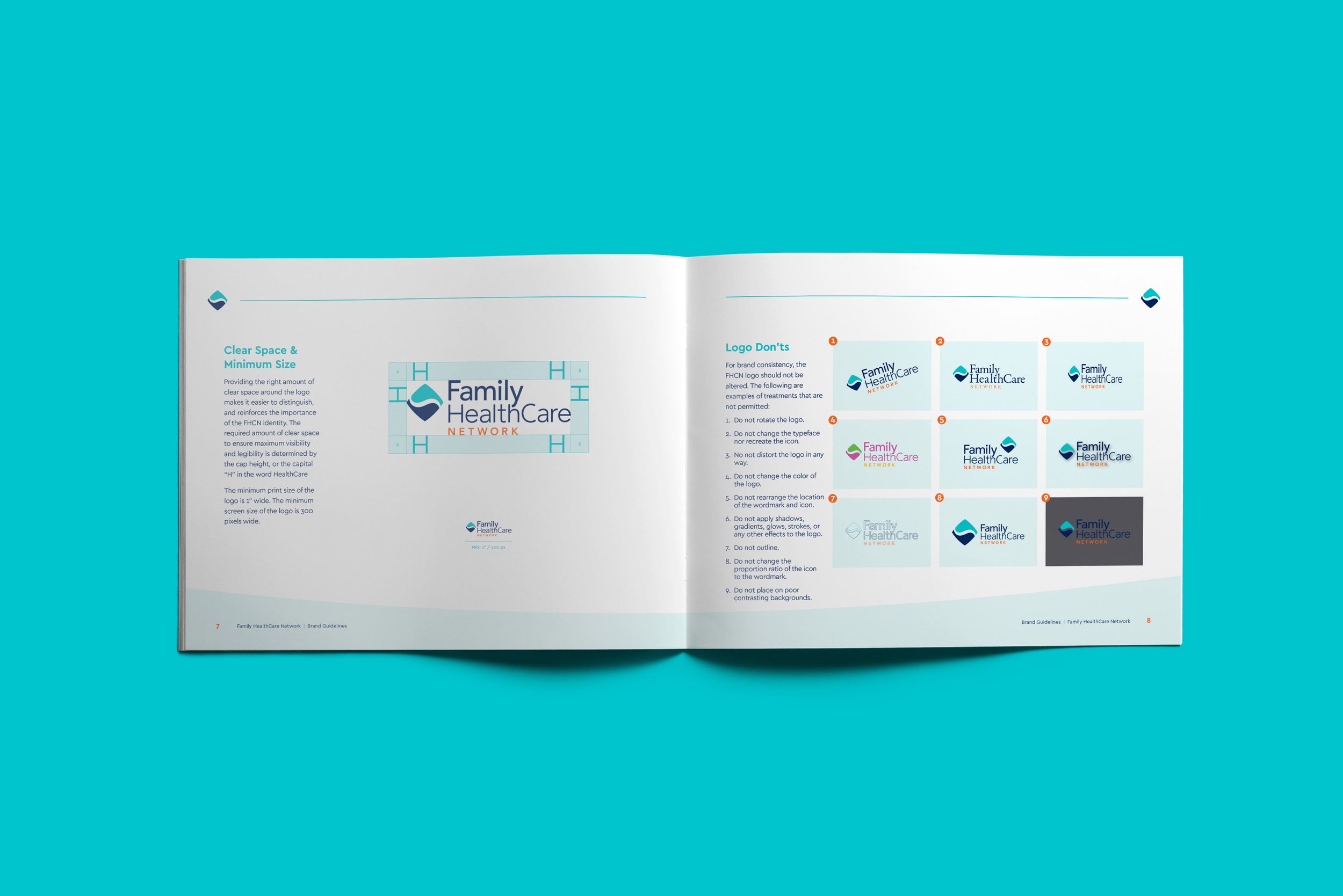
The simplicity of the mark allows it to be highly adaptable for use in large and small contexts.

The ‘wave’ design element acts as a clear-space area, keeping the FHCN logo free of other graphic elements while providing contrast from any background imagery.