The Designer Crafting Logos by Hand
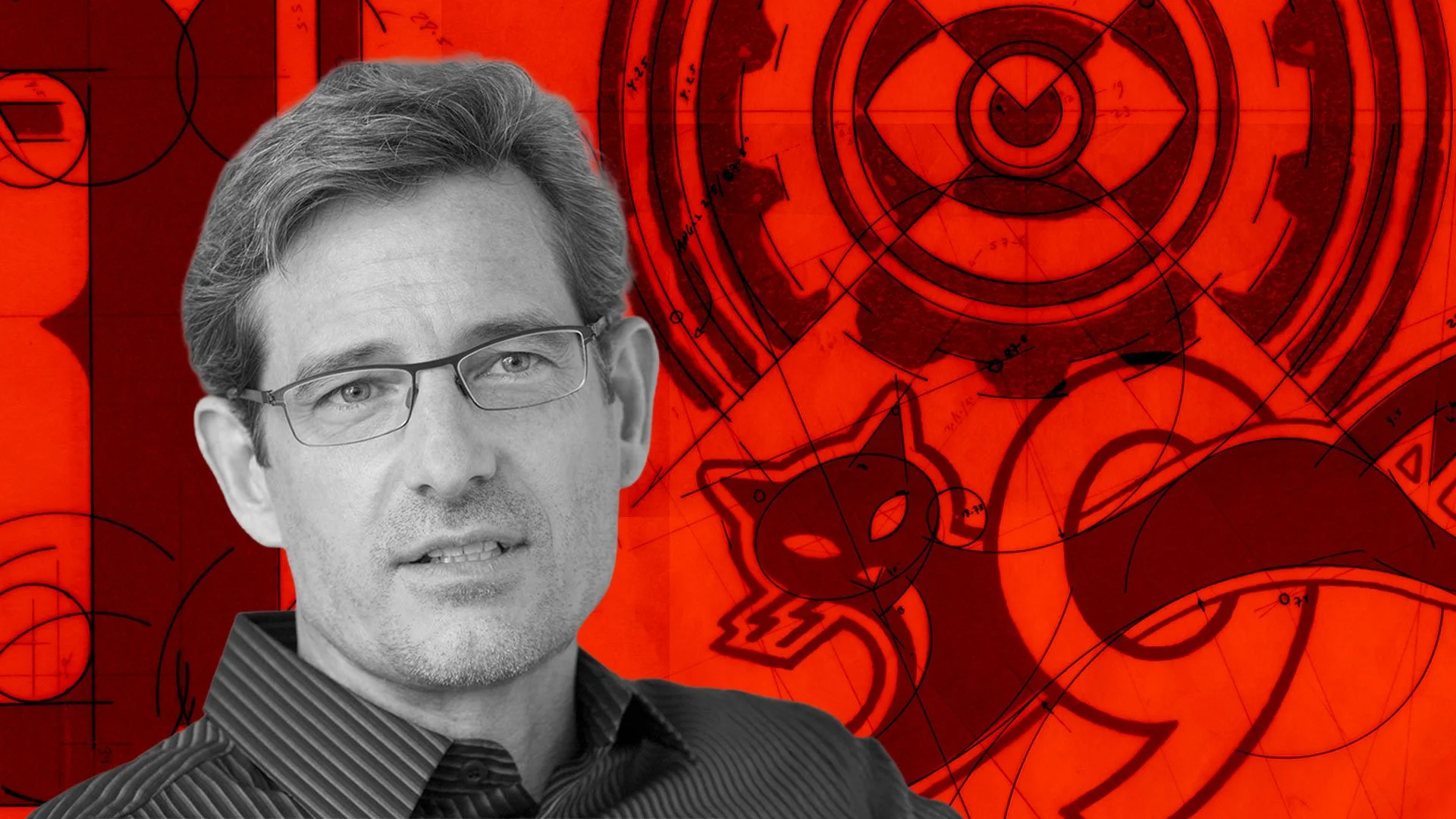
Mark Fox works the old way—by hand. At his drafting table, Rapidograph pens, triangle rulers, circle templates, and French curves surround carefully taped sheets of paper and vellum. He builds forms slowly, layering ink lines, measuring proportions, and refining curves by eye. Every stroke is intentional. Every angle is measured. Every detail is considered. It’s mark-making rooted in patience, discipline, and a deep respect for craft.
Mark is not just a skilled designer—he’s an educator and author who has spent decades refining the art of trademarks, icon systems, and custom lettering at Design is Play, the San Francisco studio he cofounded with his partner and wife Angie Wang in 2007. With roots stretching back to his two-decade career under the studio name BlackDog, Mark brings a hands-on approach to everything he designs.

Design is Play monogram. Great example of an ambigram design.
As a designer, I’m always looking for ways to grow and refine my process. Mark’s work had been a source of inspiration for some time—especially his ability to design marks by hand, using analog tools and techniques. I often turned to his book Symbols: A Handbook for Seeing for guidance on visual metaphor, and I thought it would be great if he could sign my copy someday. While I was in San Francisco, I decided to reach out to see if he might be open to not only signing my book but also sharing a bit about his design process. I sent him an email, and to my surprise, he replied—mentioning that he would be near Mission Bay, right where I was staying with my family. A few days later, we met at a local spot called Café Réveille.

Interior of Café Réveille in San Francisco. Photo courtesy of Cafe Réveille

Symbols: A Handbook for Seeing by Mark Fox and Angie Wang.

Title page of Symbols: A Handbook for Seeing, signed by Mark Fox.
Mark was humble and soft-spoken, his quiet confidence grounded in experience rather than ego. As we talked, he shared insights into his inking process—specifically the steps he took in developing the identity for Metalmark, an indoor climbing and fitness gym based in my hometown of Fresno, California.

Metalmark logo designed by Mark Fox.
He walked me through how he chose the name, inspired by a native California butterfly and how the icon itself is modeled on the aluminum cams used in outdoor rock climbing—tools designed to support climbers with strength and reliability. He explained that the typeface he based the wordmark on, Rockwell Antique, wasn’t commercially available, so he redrew the letters by hand before translating the design digitally. Hearing him describe the care and thinking behind each decision only deepened my appreciation for the mark—and the method behind it.

Early Metalmark logo concepts and sketches by Mark Fox.

Hand-drawn lettering for the MetalMark logotype.

Mark has been teaching graphic design at California College of the Arts (CCA) in San Francisco since 1993. After speaking with him, it became clear why he chose a career in education. He’s patient, curious, and generous with his knowledge. As he walked me through his design process, he didn’t just talk about what he made, but also why and how he made it. He’s just as skilled at teaching as he is at creating marks.


Mark’s logos combine bold modern simplicity with playful, symbolic imagery. His work is a combination of custom lettering, monograms, and minimal icons—often animals, objects, or human figures. What’s impressive is that they’re all created by hand, the way designers worked before the digital era.

Capitalism Consuming His Children (Moloch) poster by Mark Fox, displayed in my office.
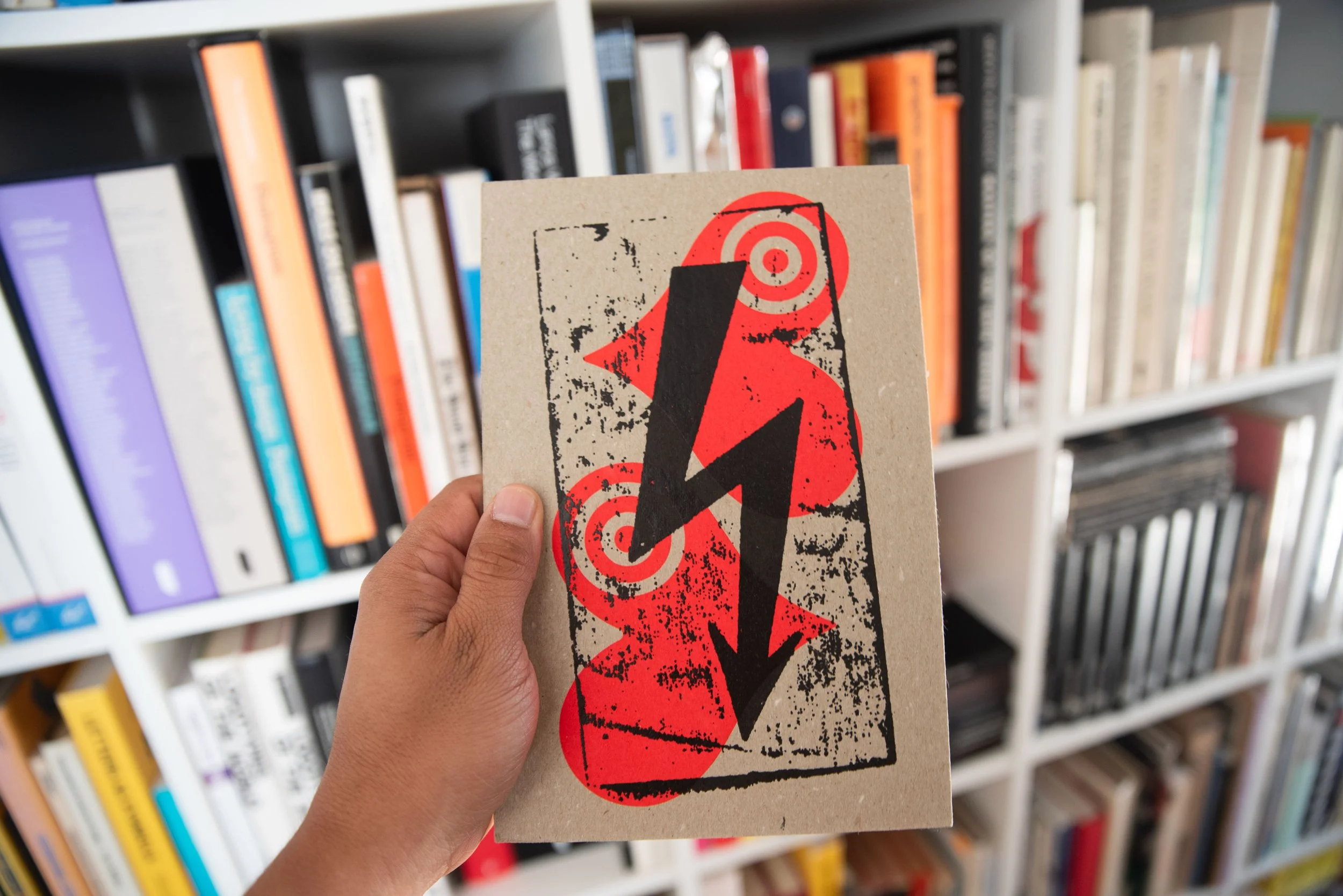
What impressed me as much as his work was his generosity. Along with treating me to a cup of coffee and signing my book, Mark gave me some of his design pieces, including a poster titled Capitalism Consuming His Children (Moloch), a print titled High Voltage Love, and other beautifully designed pieces. I’ll definitely need to make some space on my walls for them.


In a world that moves fast, Mark’s slow, hands-on process is a breath of fresh air. Every decision carries meaning, and he’s as passionate about sharing his knowledge as he is about creating. Talking with Mark left me inspired—not only to put more care into my own work, but also to be more generous with what I’ve learned along the way.