Meeting the Co-Creator of NASA's Worm Logo
A few weeks ago, I was browsing the design section at Dog Eared Books in San Francisco when a book behind a glass case caught my eye. Wrapped in a translucent red PVC jacket, it stood out from all the other books.
It was The Worm, a book featuring more than 200 photographs from NASA's archives, all showcasing the iconic "worm" logo. I bought it, not knowing that just a few weeks later I'd have the chance to meet one of the designers behind it.
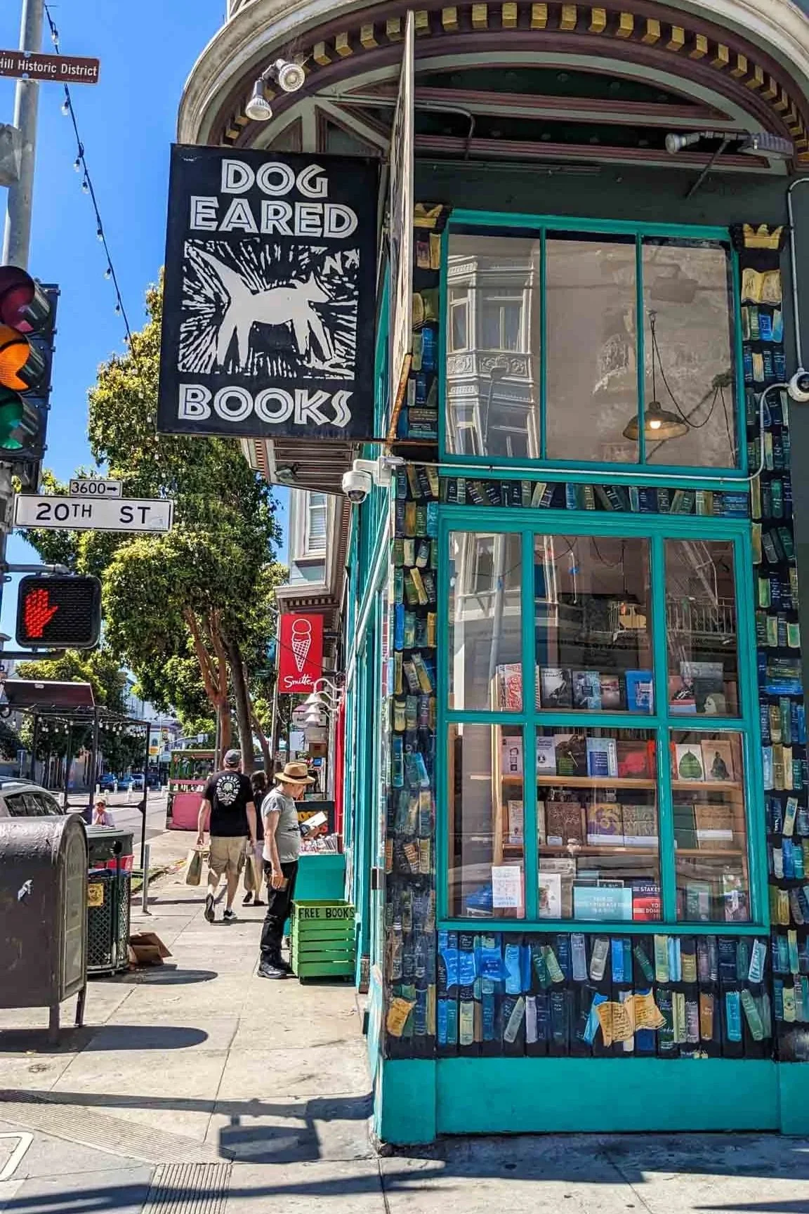
Known for its carefully curated selection of new and used books, Dog Eared Books has been a longtime favorite in San Francisco's Mission District since 1992.
I was lucky to stumble upon The Worm, a rare, now out-of-print gem published by Standards Manual, tucked away on the bottom shelf of a glass case.
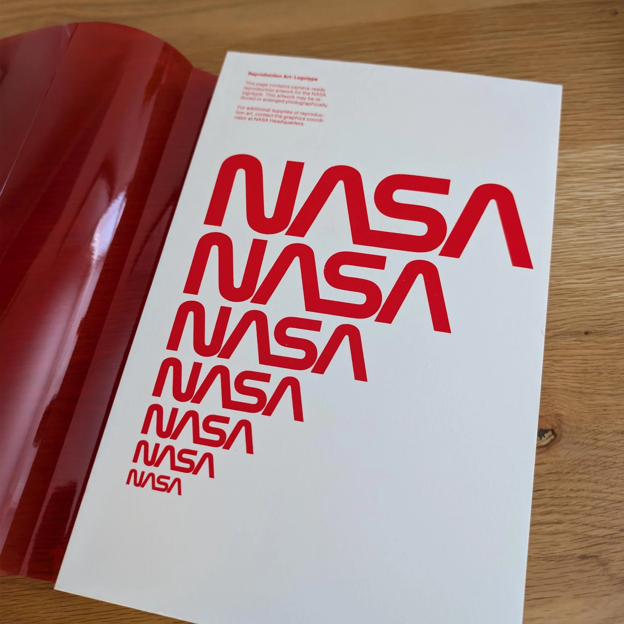
The Worm showcases over 200 images from NASA’s archives, chosen by one simple criterion: each photograph had to feature the iconic NASA “worm” logo.
Not long after, I learned that Richard Danne, co-designer of NASA's iconic "worm" logo, would be speaking at Letterform Archive to celebrate the release of his new book, Shooting for the Stars. The timing couldn’t have been better.
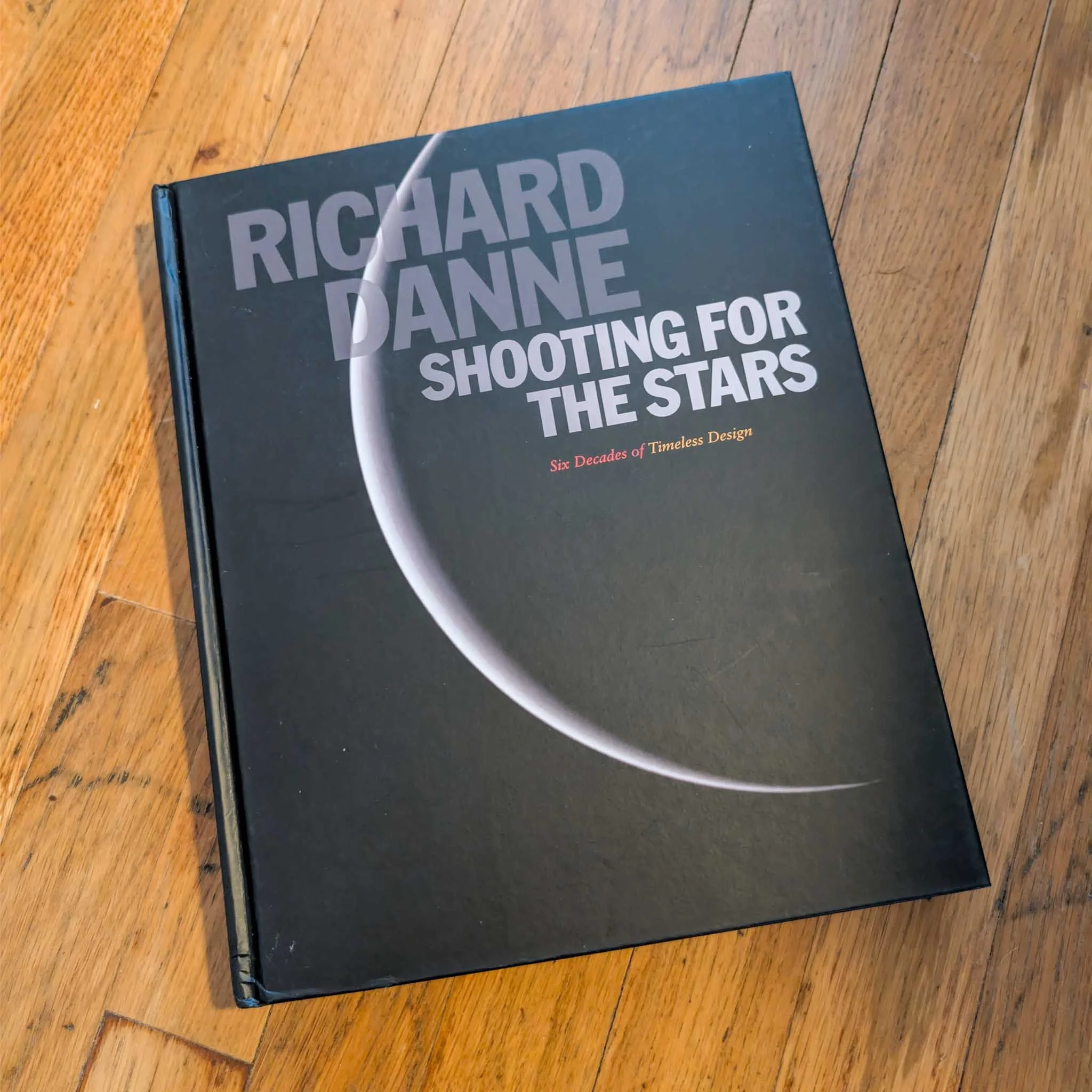
Richard Danne, Shooting for the Stars: Six Decades of Timeless Design. ORO Editions, 2024.
Soon, I found myself seated among a room full of designers, students, and NASA fans, eager to hear Danne share stories from an amazing six-decade career in design.
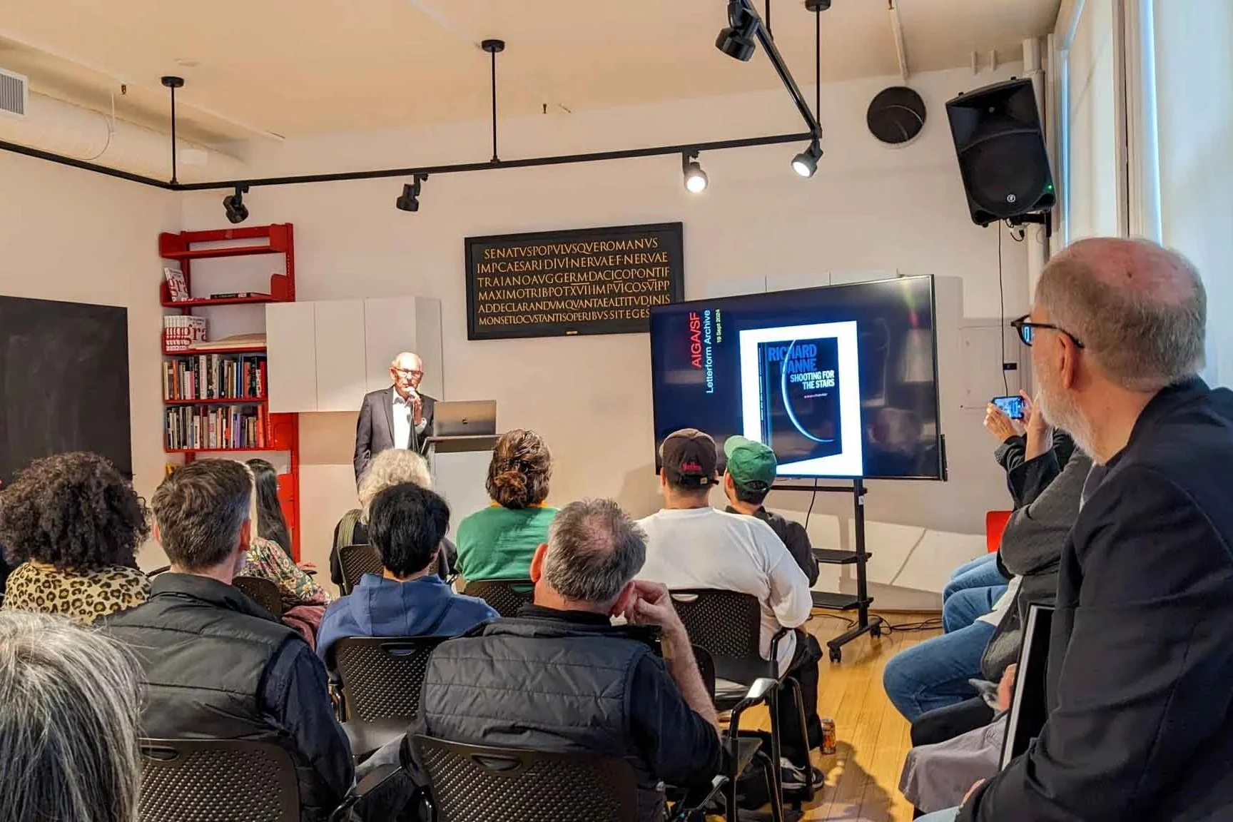
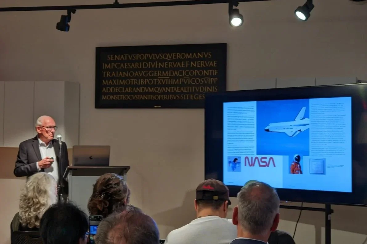
Richard Danne presents Shooting for the Stars at Letterform Archive in San Francisco, sharing stories and insights from his six-decade career in graphic design.
He opened his lecture by sharing how a kid from Oklahoma found his way into the world of design. Through photos, personal stories, and examples of his work, Danne talked about the experiences that shaped his career and led him to clients like NASA, AT&T, and Paramount.
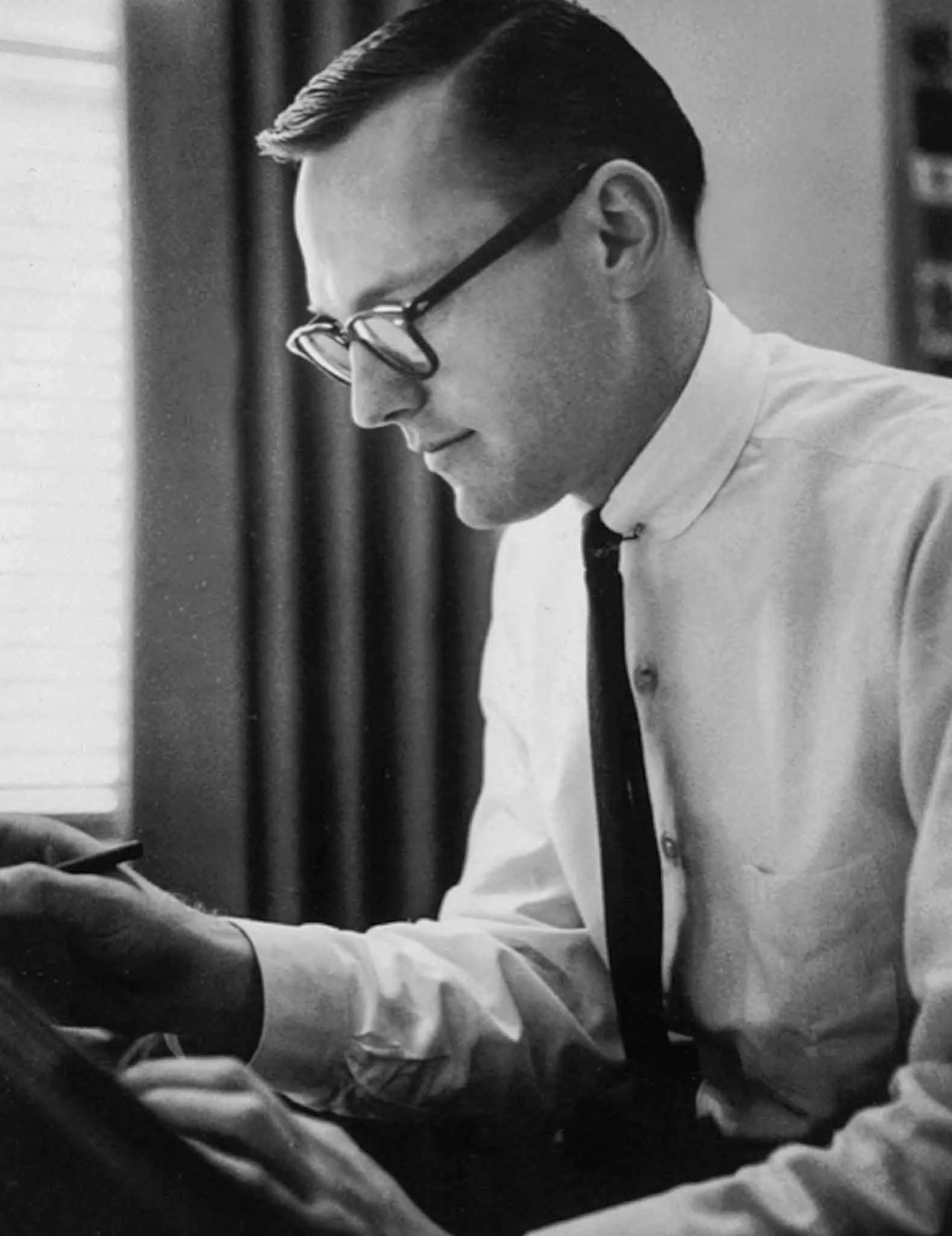
Richard Danne early in his design career, looking like a character straight out of Mad Men.
In 1969, Danne partnered with Bruce Blackburn to form Danne & Blackburn, a Dallas-based design firm that would go on to create some of the most influential corporate identities of the 20th century.
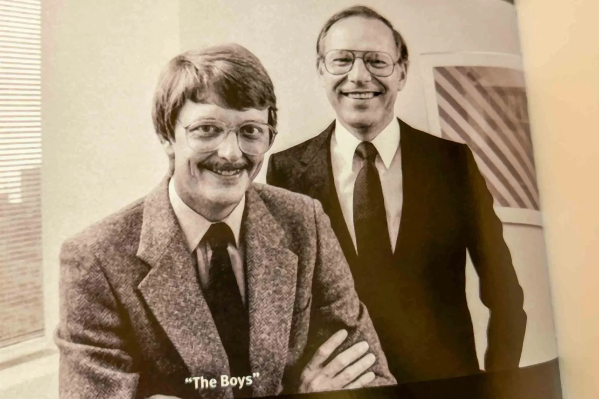
Bruce Blackburn (left) and Richard Danne in their New York City studio following the completion of the NASA Graphics Standards Manual, 1975. From Richard Danne: Shooting for the Stars: Six Decades of Timeless Design (ORO Editions, 2024).
One story that stood out was how Danne and Bruce Blackburn presented the NASA logo. Instead of showing several concepts, as many firms did at the time, Danne and Bruce Blackburn showed only one. Confident they had found the right solution, they stood behind it—and NASA agreed. That single design became one of the most recognizable logos in the world.
The A's in the logotype were intentionally designed without crossbars, creating shapes that resemble upward-pointing rocket nose cones—a subtle nod to vertical thrust and space exploration.
Danne also discussed the legendary NASA Graphics Standards Manual. First published in 1975, it's become a design classic thanks to its clean, minimalist style and the way it brought NASA's entire visual identity together. In 2015, Standards Manual reissued the book, giving a new generation of designers the chance to own and study it.
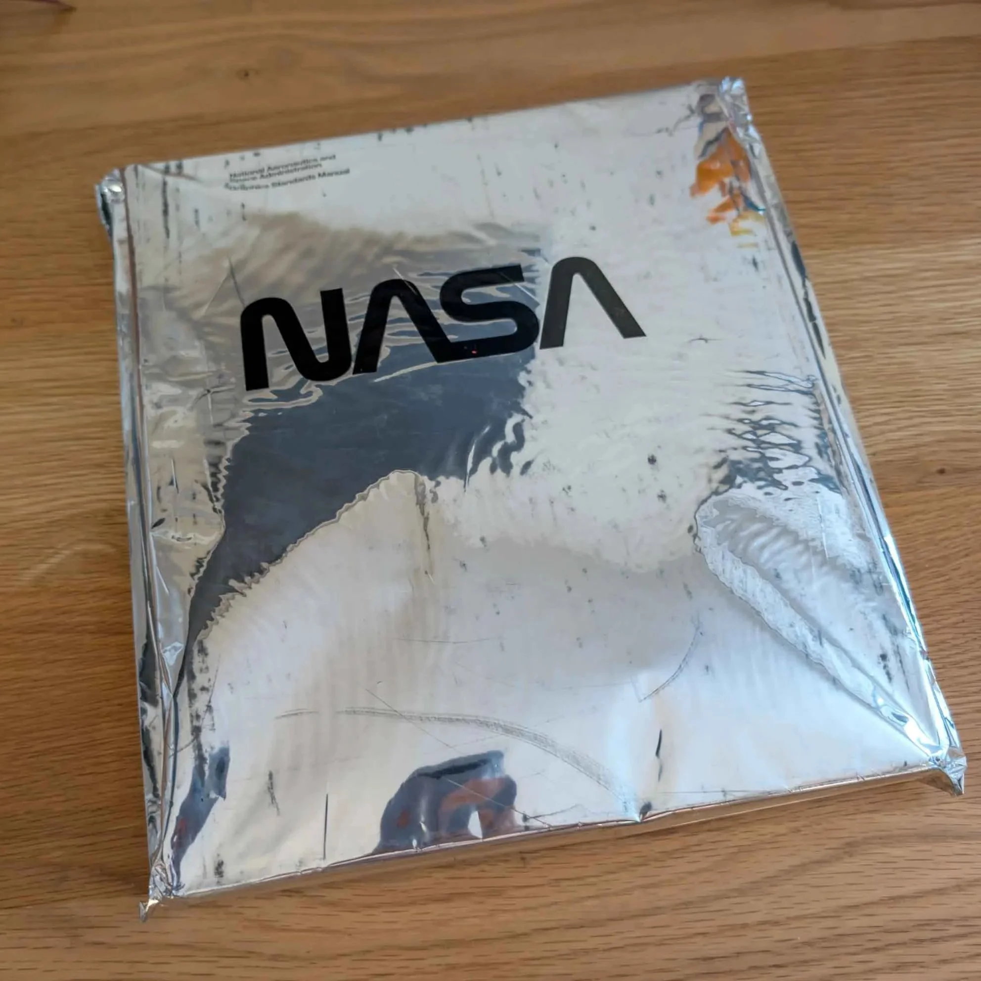
My copy of the 1975 NASA Graphics Standards Manual reissue. Published by Standards Manual in 2015, this edition features its distinctive reflective silver-foil cover and faithfully reproduces one of the most celebrated graphic identity manuals ever created.
Although the NASA "worm" is their best-known logo, it is just one example of Danne & Blackburn's exceptional identity work. Their logos combined simple geometry with striking clarity, resulting in designs that feel as fresh today as when they were created.


Danne also mentioned his interview with designer Michael Bierut at The Strand Book Store in New York City, where they discussed the story behind the NASA "worm" logo, his career, and the lasting impact of NASA's visual identity. If you haven't seen it, the full interview is available on YouTube and is well worth checking out.
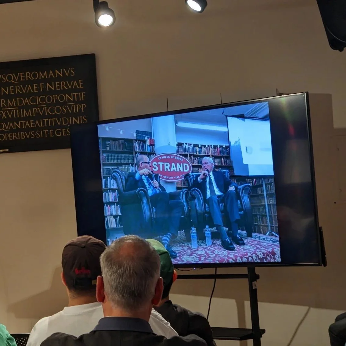
A slide highlighting Danne’s interview with designer Michael Bierut at The Strand Book Store in New York City.
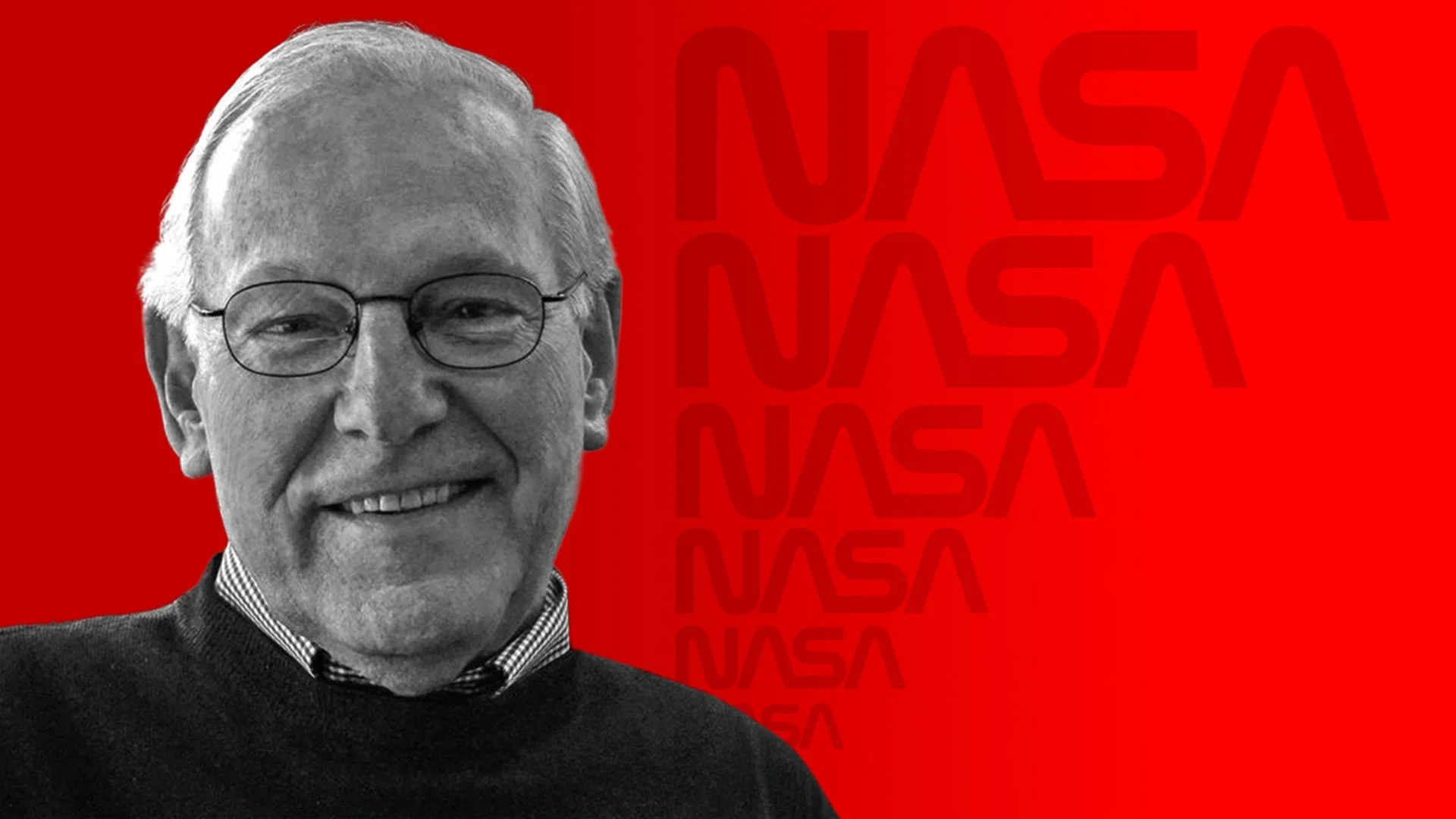
After the presentation, Danne stayed to sign books and talk with fans. He was super nice, generous with his time, and happy to chat with everyone who came through the line. I was able to get my copy of Shooting for the Stars signed, along with my copies of The Worm and the NASA Graphics Standards Manual.
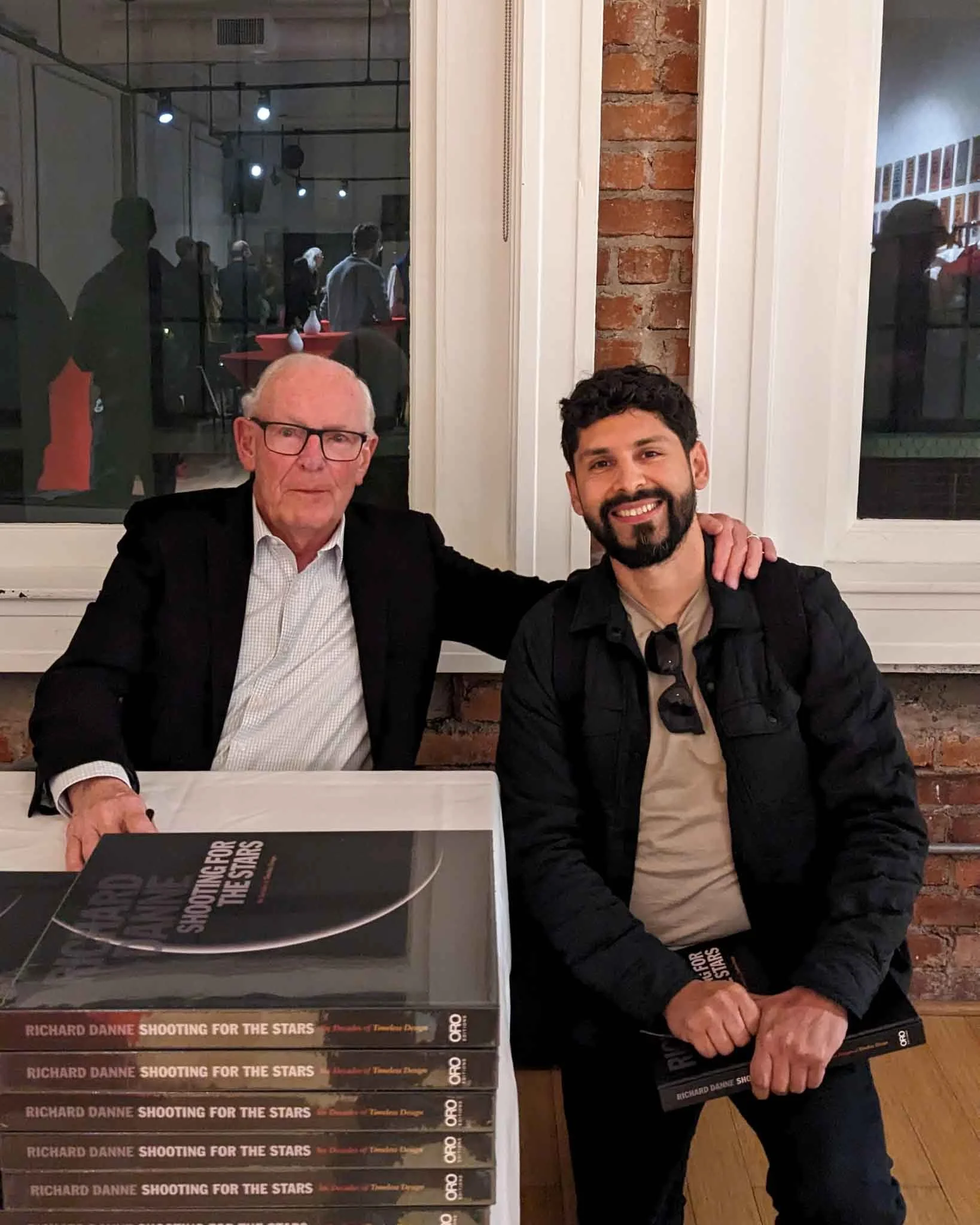
Meeting Richard Danne after his talk at Letterform Archive. After the presentation, he signed my copies of The Worm and the NASA Graphics Standards Manual.
The term "worm" for the NASA logotype was first coined as a criticism when the logo debuted. Over time, it became a term of affection. Like the light from a distant star, appreciation for great design often takes time to reach us. Nearly fifty years later, Richard Danne's NASA identity continues to inspire designers, showing that the best ideas only grow stronger with time.