Art of Noise
Music is something we hear, but it’s also something we see. Over time, design has shaped that in ways we don’t always notice. Album covers, posters, and product design have all helped define the music we love.
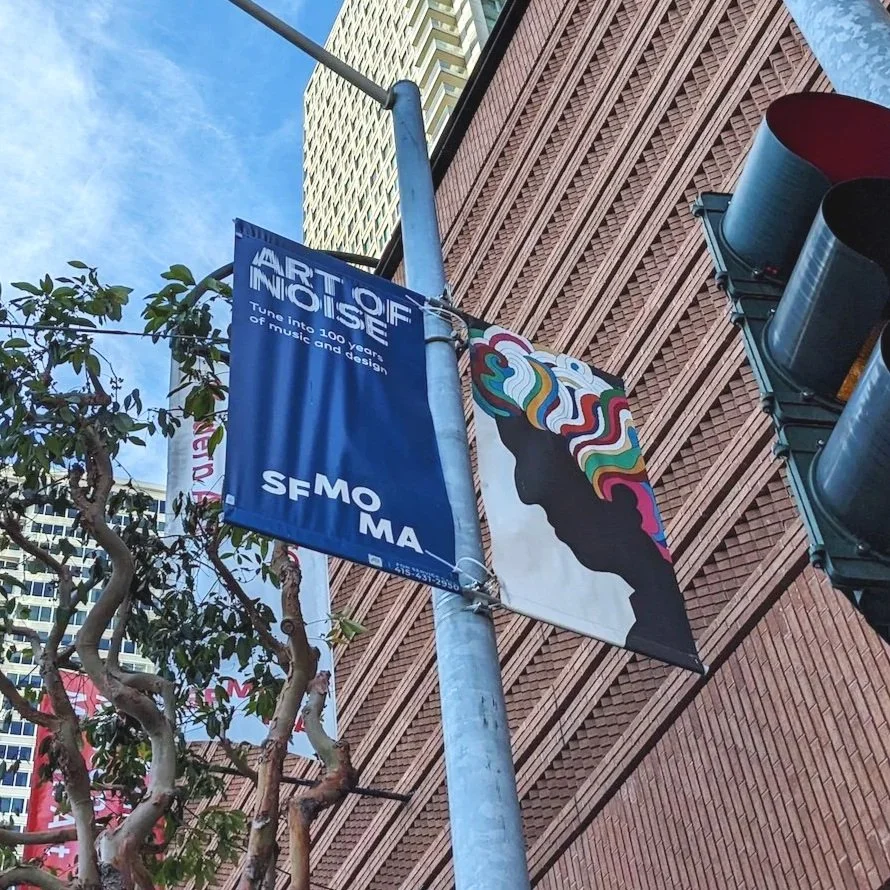
Street banners featuring Milton Glaser’s iconic Dylan poster promoting the Art of Noise exhibition about the relationship between music and design.
That’s the idea behind SFMOMA’s exhibition Art of Noise, which looks at how design has shaped our connection to music over the past century.
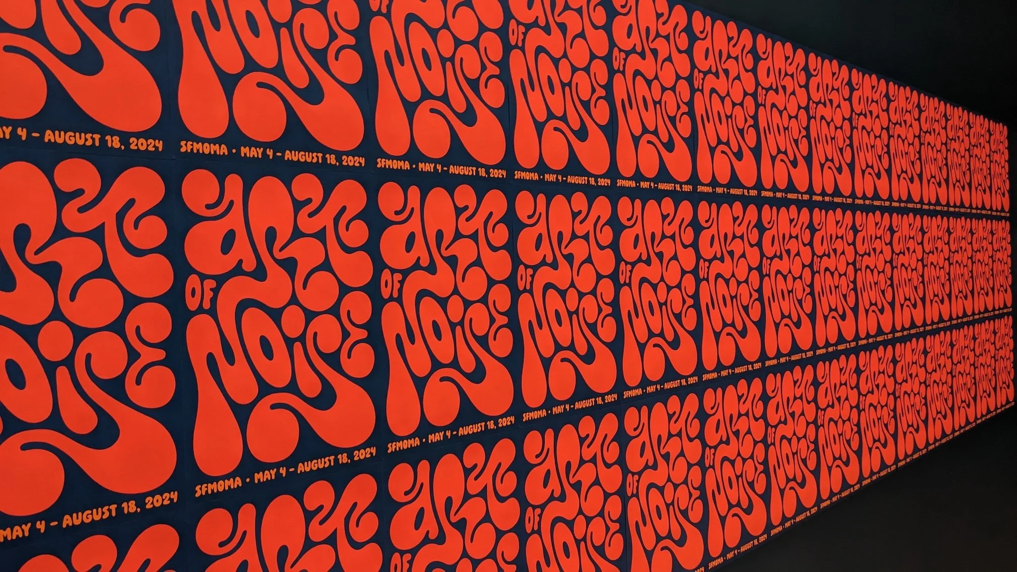
Really nice psychedelic-inspired typography repeated across the wall, giving the whole space a strong, rhythmic feel.
The exhibition is on the 7th floor of the museum and starts with a large gallery filled with album covers and concert posters. They’re arranged in a tight grid across a bright blue wall and organized by era, so you can see how styles change over time.

A wide view of the Art of Noise exhibition, with visitors exploring walls filled with album covers and posters.
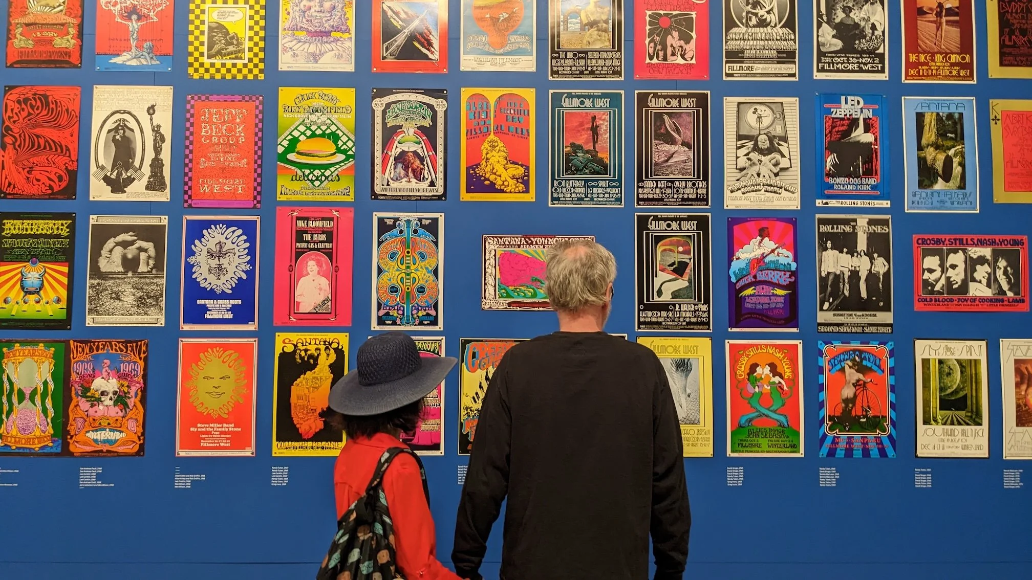
Visitors view a wall of concert posters displayed in a grid at Art of Noise at SFMOMA.
Among the concert posters are pieces for Led Zeppelin, Creedence Clearwater Revival, and Crosby, Stills, Nash & Young. Each one uses different styles, giving you a sense of the music before you even hear it.
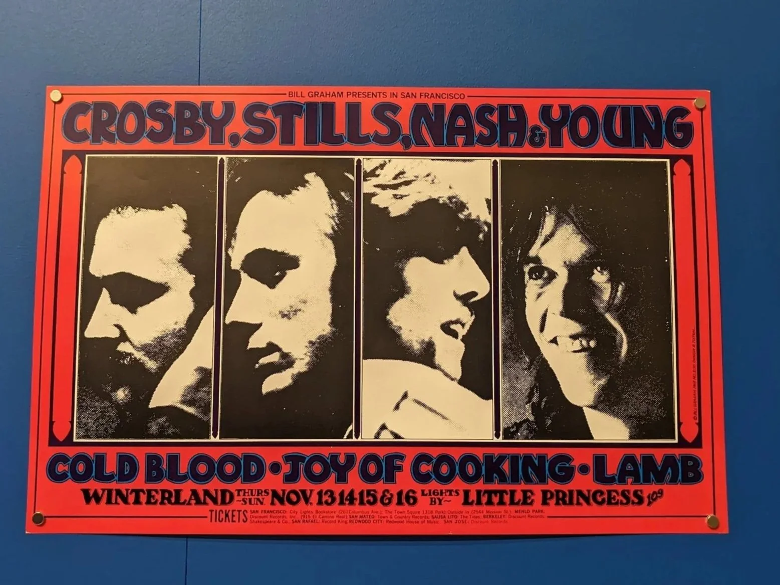
Crosby, Stills, Nash & Young concert poster on view at Art of Noise at SFMOMA.
This CSNY flyer feels distinctly 1970s through its bold, psychedelic typography, high-contrast color palette, and structured layout. The thick, rounded display type with exaggerated curves and tight spacing reflects the era’s experimental, almost groovy lettering styles.
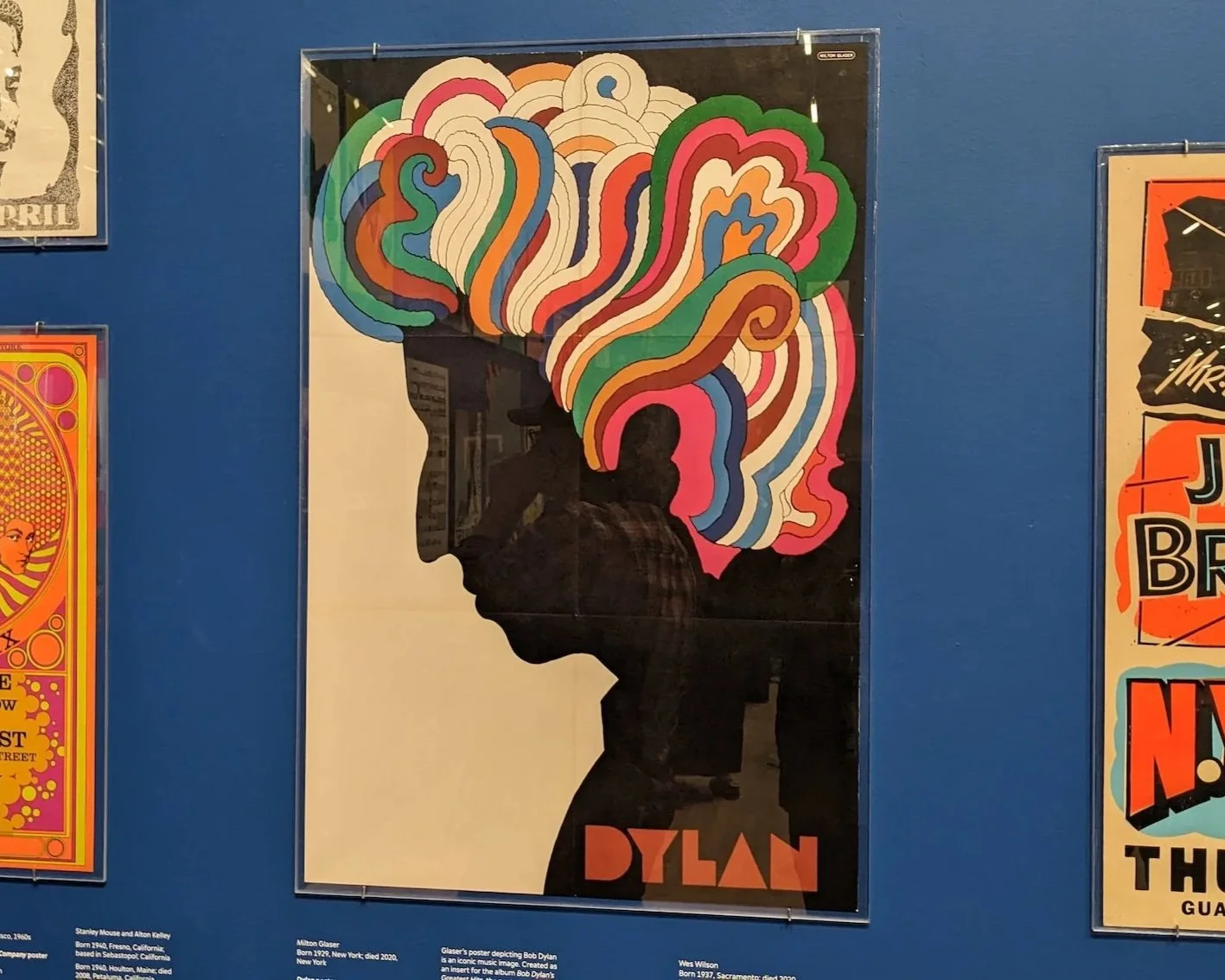
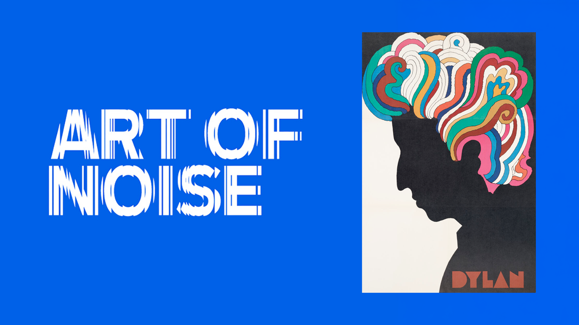
Milton Glaser’s Dylan poster is one of the most recognizable pieces of graphic design history and was used as the primary image for the Art of Noise exhibition.
A minimalist design that turns scientific imagery into an instantly recognizable cultural icon.
The iconic Dylan poster by Milton Glaser uses a simple silhouette and bright, flowing shapes to make sound feel visual. The swirling colors feel rhythmic and show how designers captured the energy of music without showing it literally.
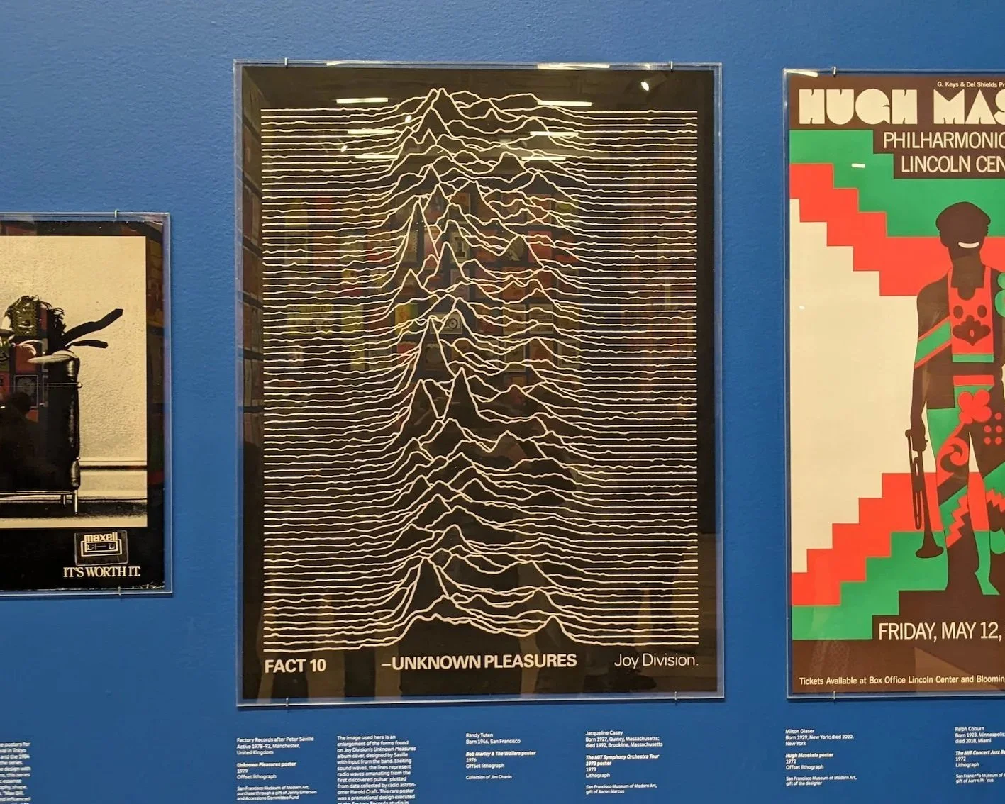
In contrast, the Joy Division poster by Peter Saville features a black-and-white waveform graphic, where repeating lines and clean spacing create a hypnotic, almost scientific feel.
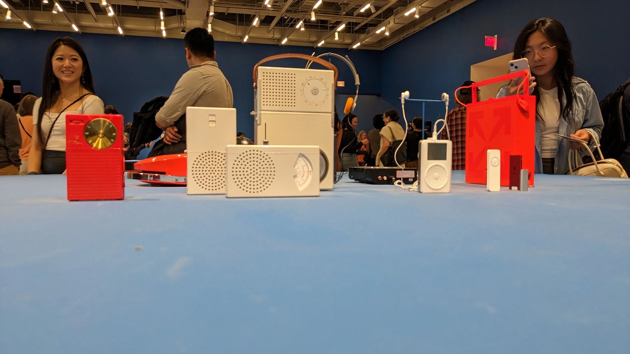
Dieter Rams’ influence shows up clearly in Apple products like the iPod and continues to shape modern design today.
The exhibition moves from posters to the devices themselves. Older radios with bold colors and dials sit next to clean, simple designs influenced by Dieter Rams.
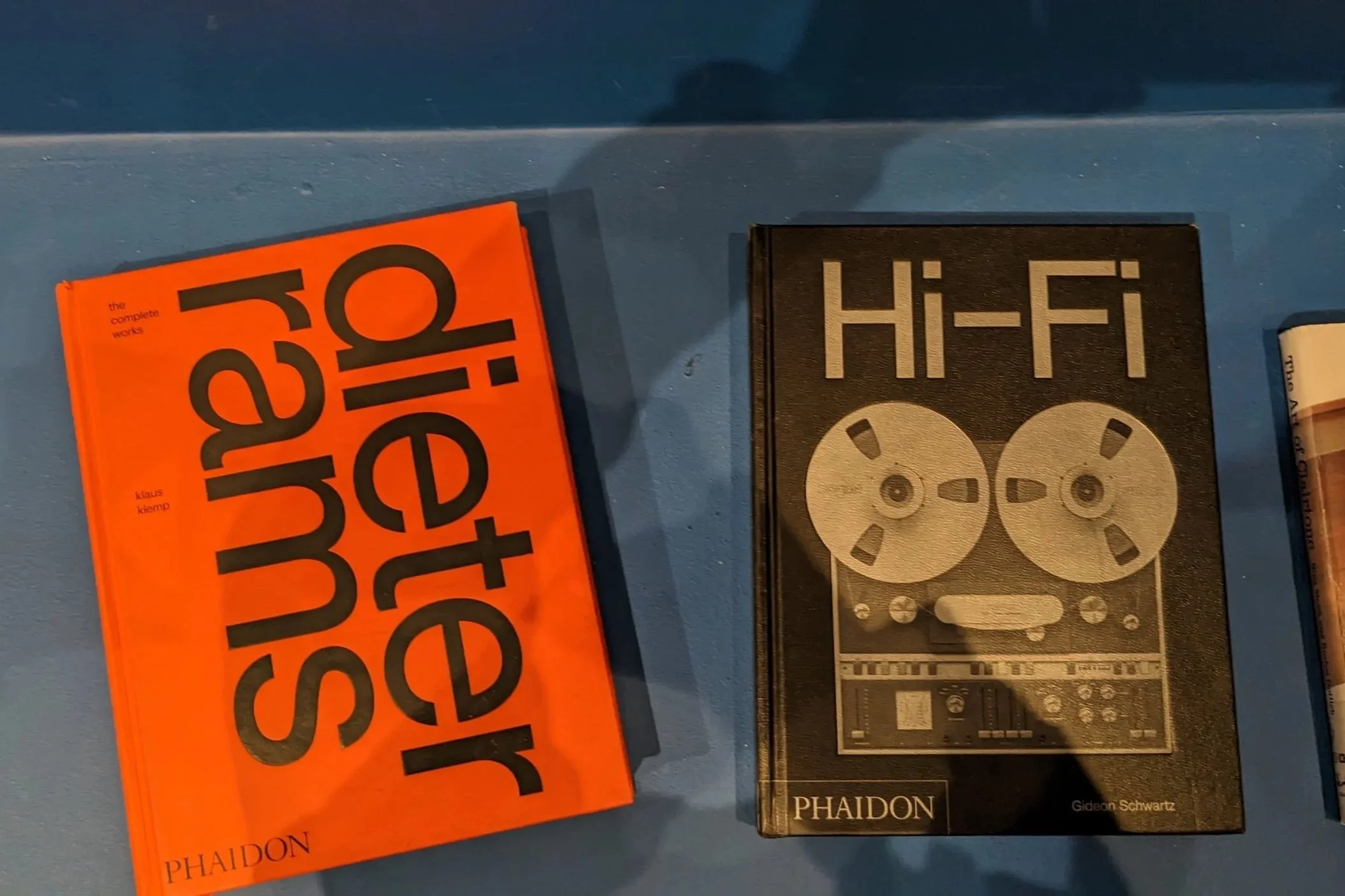
Books on Dieter Rams and hi-fi design highlight the connection between product design and the culture of listening.
This was a really interesting exhibition to check out, especially seeing how different types of design connect to something as universal as music. Even without realizing it, design shapes how we listen and what we notice. It runs May 4–August 18, 2024.