Meeting Craig Frazier

Even if you haven’t heard of illustrator Craig Frazier, there’s a good chance you’ve seen his work without realizing it. His original LucasArts logo—a golden figure with raised arms beneath a rising sun—appeared before some of the most popular Star Wars games of the ’90s and early 2000s. He’s also the hand behind several U.S. postage stamps, editorial pieces for The New York Times, and artwork for major brands like Adobe, Chevrolet, and American Express.
Born in California and based in the Bay Area, Frazier has been creating illustrations professionally since 1978. He studied design at Chico State and spent his first two decades as a graphic designer before shifting his focus to illustration. His big break came when he developed a signature style built on visual riddles, abstract concepts, and graphic wit—a style that quickly made him a favorite among editors, art directors, and design-minded clients.


Frazier recently released a new book called Drawn, his second monograph following The Illustrated Voice from 2003. I was lucky enough to attend the book party he hosted at the Letterform Archive in San Francisco. It was a small, casual gathering filled with illustrators and designers—including industry legends like Kit Hinrichs, Linda Hinrichs, Michael Schwab, and Michael Carabetta.

Craig Frazier’s two monographs: Drawn (left) and The Illustrated Voice (right), showcasing decades of idea-driven illustration. Both signed by the illustrator.
Frazier spoke about his career, his love of drawing by hand, and how he’s always tried to stay true to the idea, not the trend. He shared stories from early client work to more recent projects, all delivered with the same dry humor and clarity you see in his illustrations. He wrapped up with a Q&A session and a book signing where I got to meet Craig and talk to him briefly about his book and his early logo work.


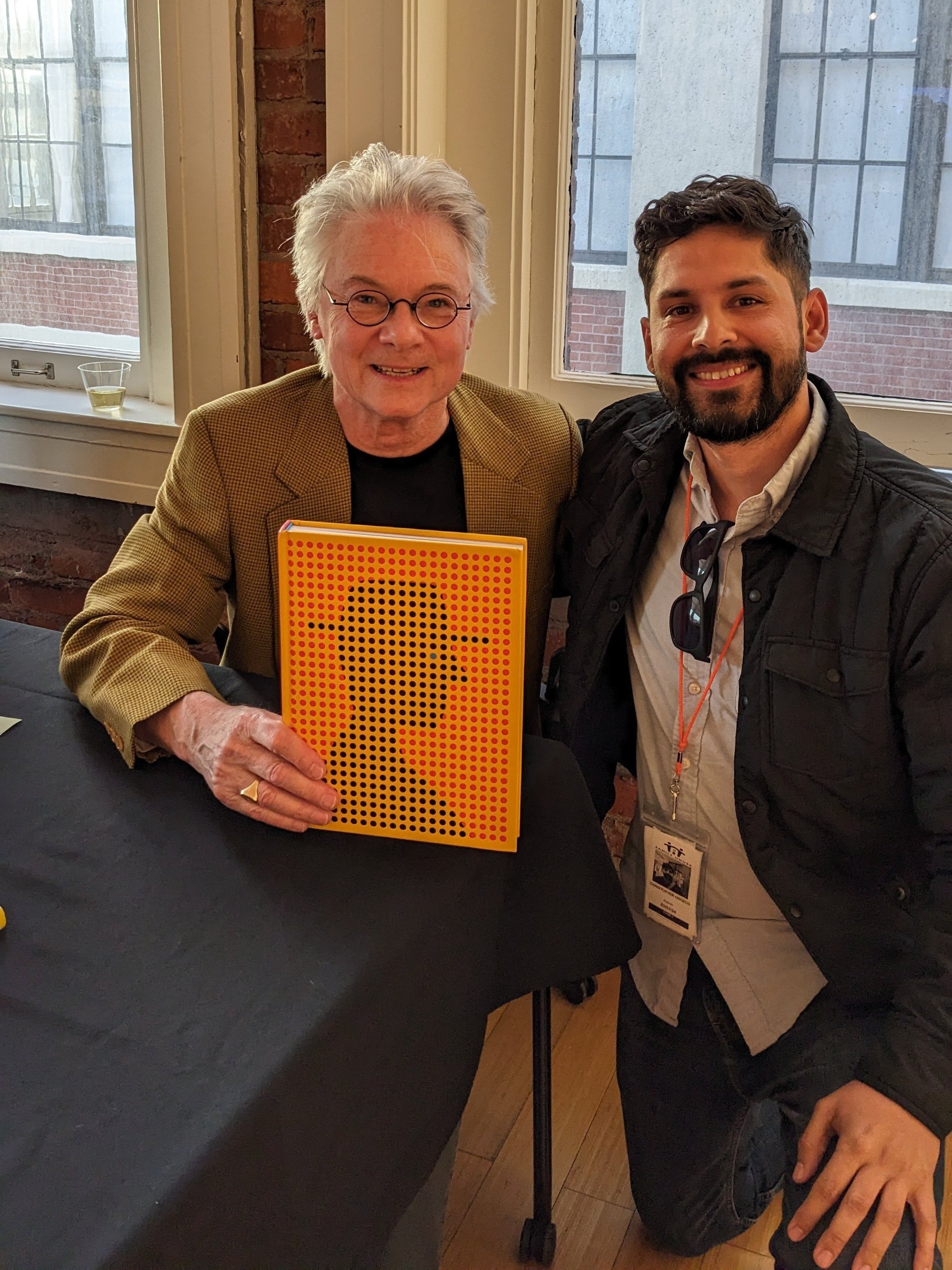
Meeting the legendary Craig Frazier at the Drawn book release party at the Letterform Archive in San Francisco.
Although he’s best known for his illustrations, Craig Frazier has also made a lasting mark in the world of corporate identity. His approach is consistent across disciplines—simple, smart, and idea-driven. A great example is his logo for Wilburn Forge: a stylized flame that cleverly uses negative space to form a “W.” It’s a visual puzzle—minimal, memorable, and meaningful. Here are a few more marks designed by Craig.

Frazier’s creativity also extends into type design. He developed a font called Critter, in which each letter takes the shape of an animal whose name starts with that letter—A for ape, B for bear, C for catfish, and so on. Critter is a fully functional font and is currently available on Adobe Fonts. Here’s my name using the font:

Critter font available on Adobe Fonts.
Whether it’s an illustration, a logo, a stamp, or a font full of animals, his ideas come first. That’s the thread that ties all of Craig Frazier’s work together—an unwavering commitment to concept over trend, substance over surface. His drawings may appear playful or minimal at first glance, but each one is carefully considered, built on a foundation of thoughtful problem solving and visual storytelling.