A Logo You Can't Refuse
There are movie logos, and then there’s The Godfather logo. Even if you haven’t seen the film (though, who hasn’t at this point?), you probably recognize that famous puppet hand pulling the strings. The logo is more than just a visual—it’s an instant connection to the Corleone family, the mafia underworld, and all the greatness of Francis Ford Coppola’s masterpiece. It's one of those rare, timeless designs that perfectly captures the film's themes while remaining iconic in its own right.
But why does this logo resonate so much? Let’s take a closer look.
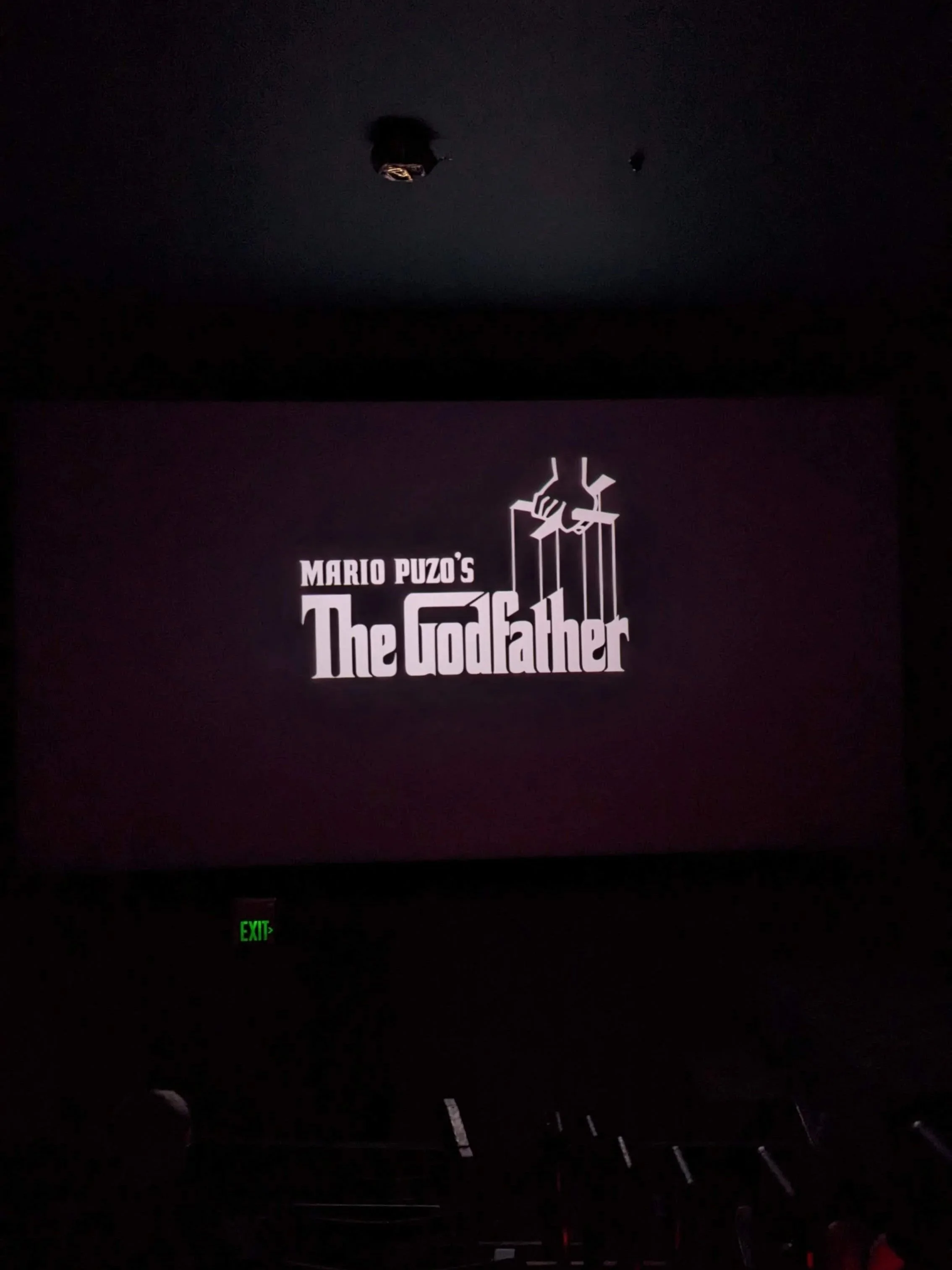
The Godfather title card.
The genius of The Godfather logo lies in its simplicity. It’s a clean, bold typeface paired with an image that tells a whole story. The type itself is strong, tall, and sturdy, mimicking the authority and power of Don Vito Corleone. It’s almost as if the letters are untouchable, commanding respect just by standing there.
Then, of course, there’s the puppet hand—the real stroke of brilliance. It symbolizes control, manipulation, and the idea that someone is always pulling the strings. It’s a visual metaphor for the entire film, where everyone’s fate seems to be controlled by the powerful, invisible forces of the mafia. It’s the perfect representation of the Corleones’ influence, both on their family and the world around them.
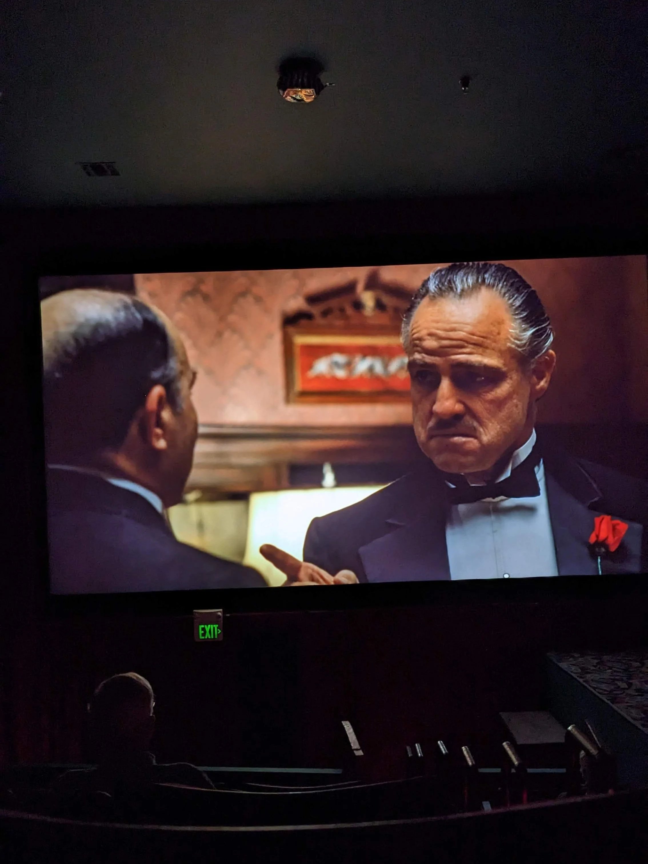
The Godfather playing at the Presidio Theatre in San Francisco on 11/14/2023.
And while the puppet strings are an obvious connection to the book’s title (which refers to Don Vito as the "Godfather" who controls everything), it’s also a smart nod to the larger theme of manipulation. Everyone in The Godfather is either pulling strings or being pulled by them.
What’s fascinating about this logo is how timeless it is. Designed in 1972, it still holds up today, nearly five decades later. No unnecessary flourishes, no dated fonts, just a clean, simple design that conveys power, authority, and intrigue in an instant. It’s a logo that fits the film’s tone perfectly—serious, dark, and larger than life—without trying too hard.
There’s also something to be said about its adaptability. The logo works just as well on a movie poster as it does on a DVD cover or even a T-shirt. It’s versatile and iconic in a way that few film logos are.

American graphic designer S. Neil Fujita.
So, who’s the mastermind behind this iconic design? That would be S. Neil Fujita, an American graphic designer whose work spans various industries. Fujita was born in Hawaii in 1921 and studied at Chouinard Art Institute (now CalArts) in Los Angeles. After serving in World War II, Fujita moved to New York, where he made his mark designing album covers for jazz legends like Miles Davis and Dave Brubeck.
In the late 1960s and early 1970s, Fujita began working for Columbia Pictures, where he designed the logo for The Godfather. While many remember him for his album covers, his work on The Godfather logo stands as one of his most significant contributions to graphic design. Fujita had a knack for distilling complex ideas into simple, bold visuals, which is why his designs remain timeless. His work on The Godfather—that delicate balance between type and image—exemplifies his ability to use minimalism to convey deep meaning.
The Godfather logo isn’t just a logo; it’s a piece of cinematic history. It communicates so much with so little, tapping into the film’s core themes of power, control, and legacy in just one glance. And thanks to S. Neil Fujita’s brilliance, it’s still one of the most recognizable and respected logos in film history. If there’s one lesson to take from this logo, it’s that sometimes, the most impactful designs are the ones that say the most with the fewest elements.