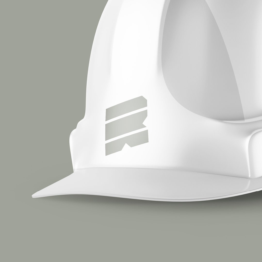
Rise Utility
Brand identity for a collective of entities that offer services in utility consulting, design, and construction.
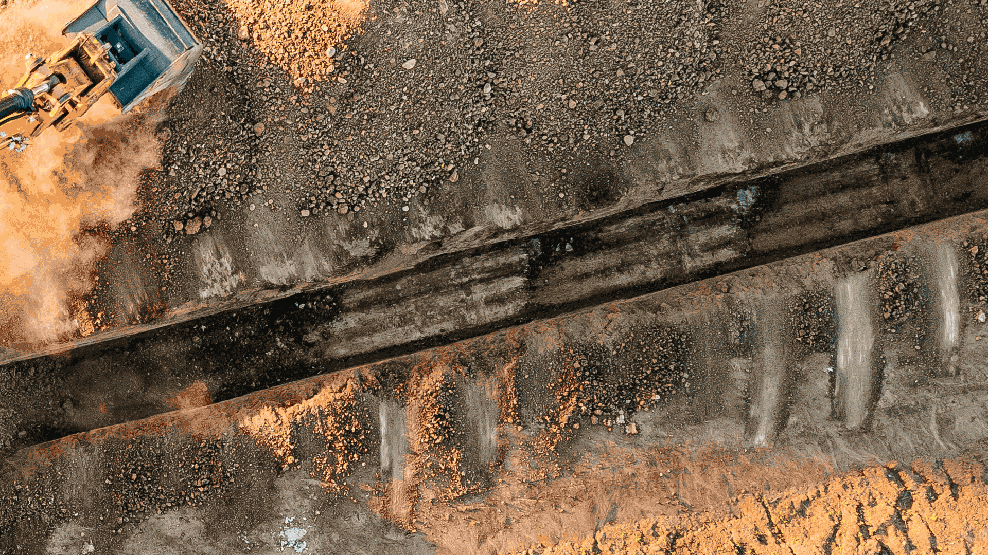
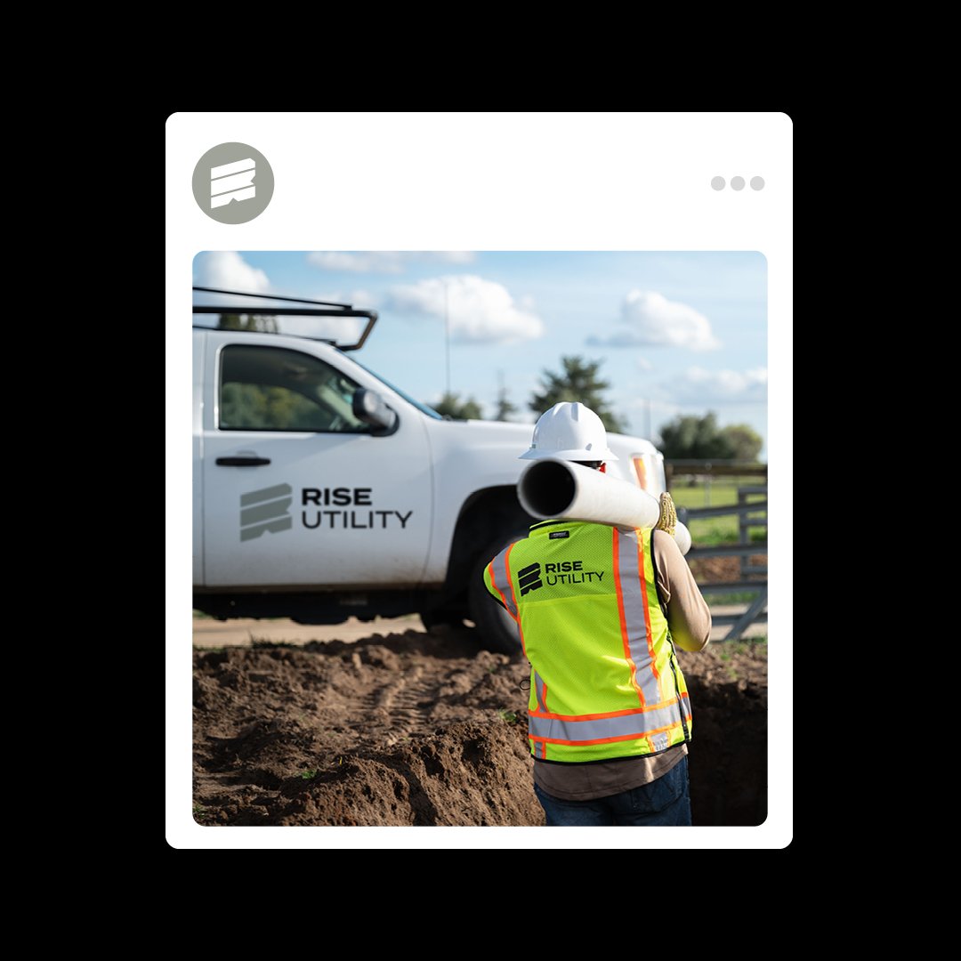
Rise Utility operates as a cooperative of specialized entities, united by a commitment to delivering seamless utility solutions. By integrating expertise across consulting, design, and construction, Rise Utility delivers comprehensive utility services that transform infrastructure challenges into community advancements.
-
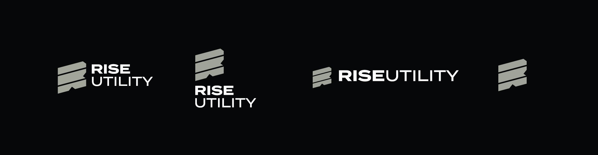
As the graphic designer for the RISE Utility project, I was responsible for designing the visual identity. This involved creating a cohesive visual language that reflected the company’s commitment to excellence and efficiency. I developed the logo system, typography, and color schemes, ensuring that the design aligned with the company’s core values and resonated with its target audience. The identity I crafted serves as the foundation for RISE Utility’s visual presence, establishing a strong and consistent look across all materials.