Brooks Ransom Associates
Updated brand identity for the largest structural engineering firm in the Fresno metropolitan area.

Brand Strategy: Sean Tambagahan | Photography by Chance James
Brooks Ransom Associates is a trusted structural engineering firm with over 45 years of experience, known for reliable, forward-thinking solutions. They specialize in educational and commercial projects, delivering precise designs that support long-lasting, high-quality structures.
-
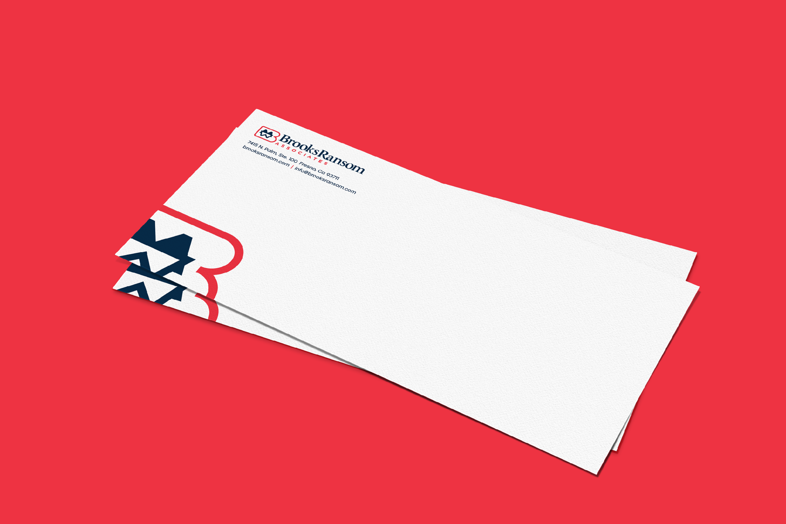
Brooks Ransom Associates underwent a comprehensive rebrand to modernize their visual identity and strengthen their market presence. As part of this effort, my role was to refresh their logo, creating a sleek, modern design that aligned with the overall transformation. The rebrand also included a redesigned website with enhanced functionality and updated stationery that reflected their commitment to quality and innovation. This strategic update has reinforced Brooks Ransom Associates’ reputation as a trusted partner in the architectural and development sectors and positioned them for continued growth and success.
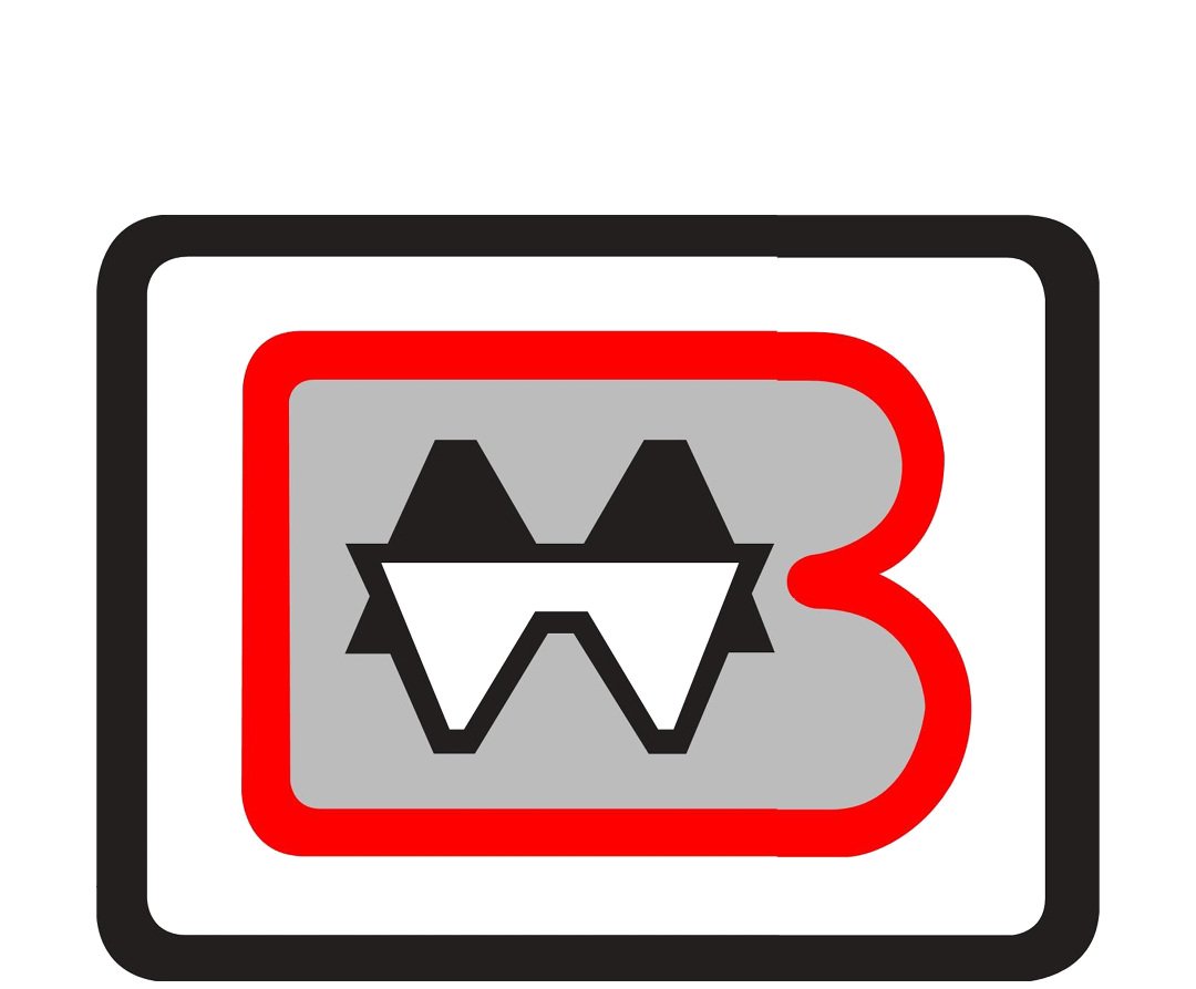
Before
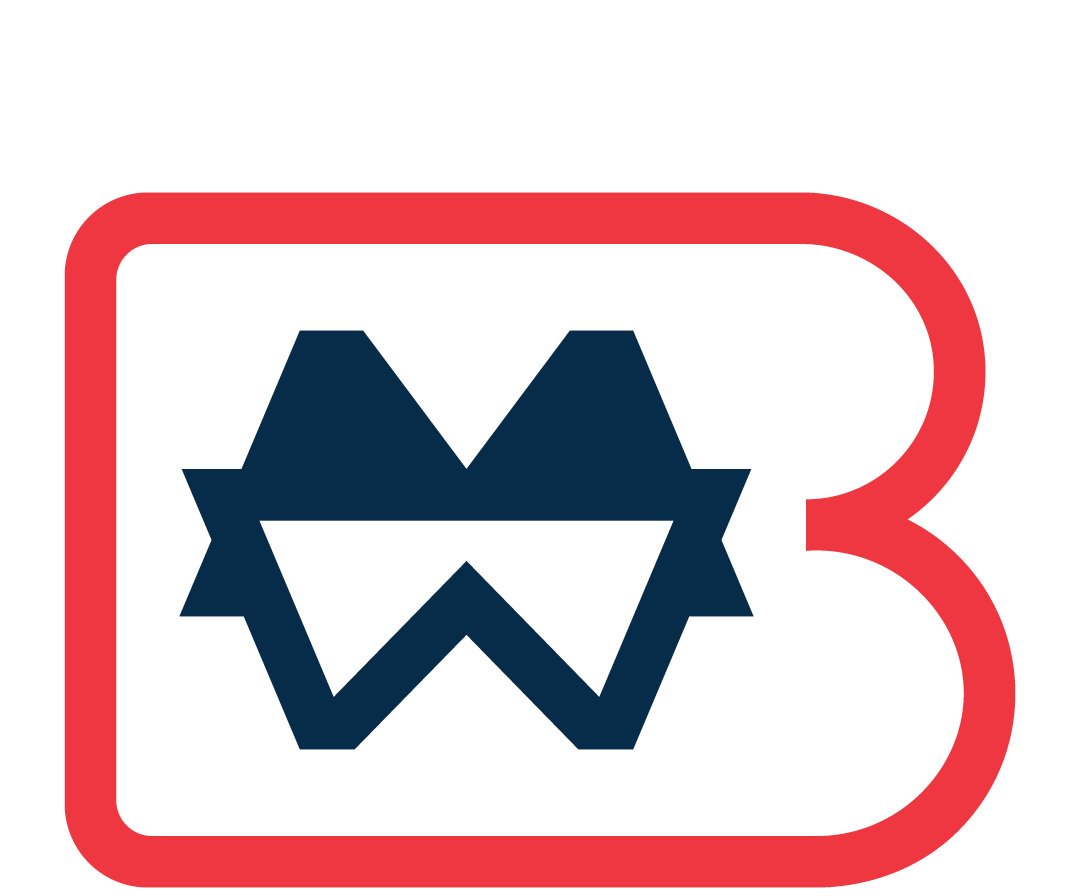
After
The original Brooks Ransom logo featured a geometric design with a gray background, a red "B," and a black-and-white monogram enclosed in a heavy outline. While recognizable, it felt outdated. The refreshed logo removes unnecessary elements, opting for a cleaner, more modern look. The gray background and black outline were eliminated, leaving a minimalist navy-blue monogram framed by a vibrant red "B." This redesign retains the essence of the original but aligns with Brooks Ransom’s more modern, forward-thinking identity.

The logo is constructed with precise geometric shapes, using intersecting lines and curves to create a balanced, symmetrical monogram. The design, based on circles and straight lines, ensures perfect proportions and reflects the firm's focus on precision and engineering excellence.