The Man Who Designed Spain
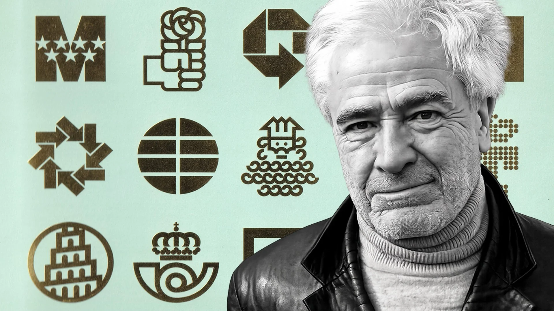
If you’ve ever been to Spain, you’ve probably seen the work of José María Cruz Novillo without even knowing it. Known as the “Saul Bass of Spain,” he helped design some of the country’s most recognizable logos and visual identities. Earlier this month, the legendary designer passed away at 89.
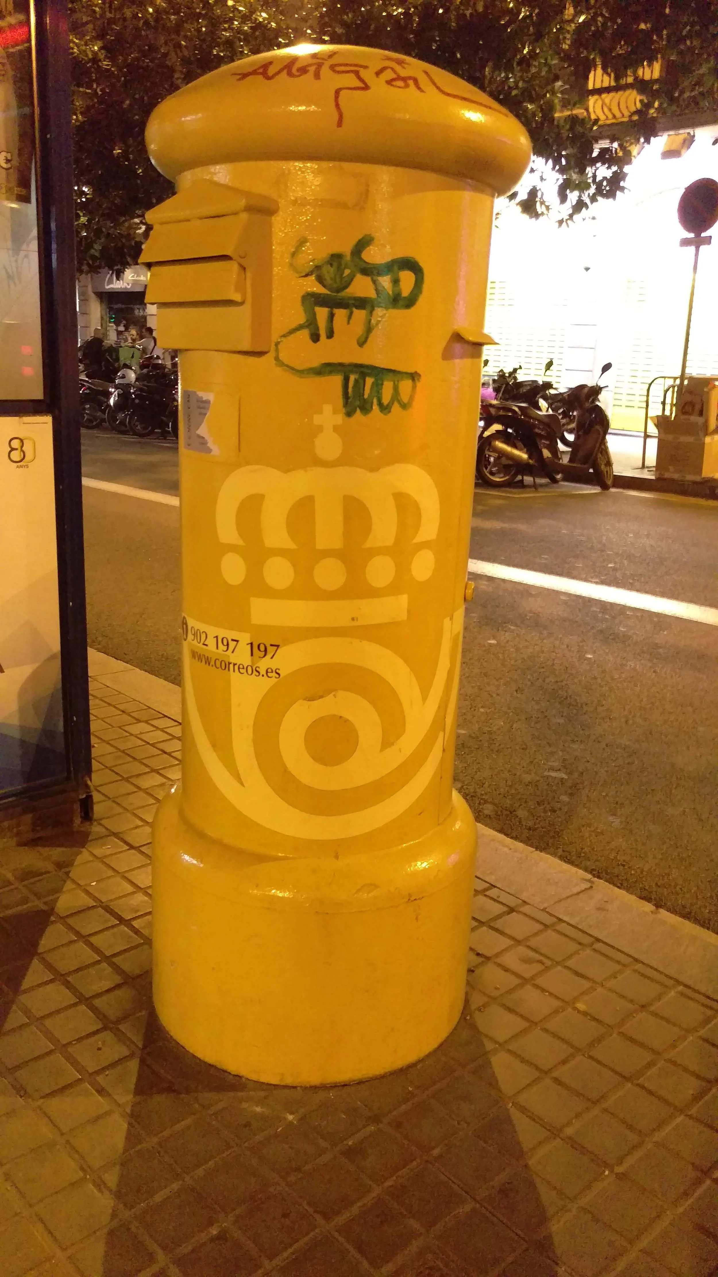
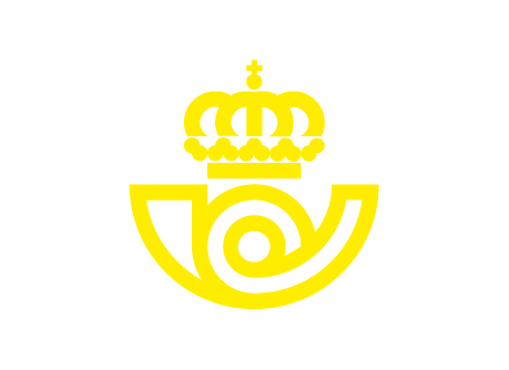
An updated version of one of Cruz Novillo’s most iconic designs, the classic Correos logo seen on this yellow postal mailbox. Photo taken during a trip I took to Spain in 2018.
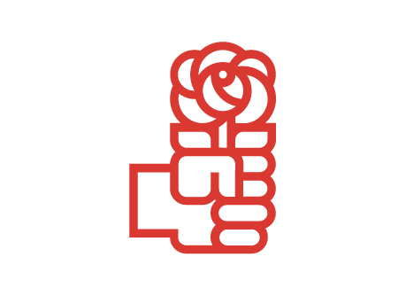
Novillo’s logos were everywhere, on trains, mailboxes, television screens, and public signs across Spain. His work was simple, clear, and often playful. Over the years, he designed identities for Correos, Renfe, Repsol, and Endesa, along with the famous PSOE fist-and-rose symbol, one of my personal favorites of his.
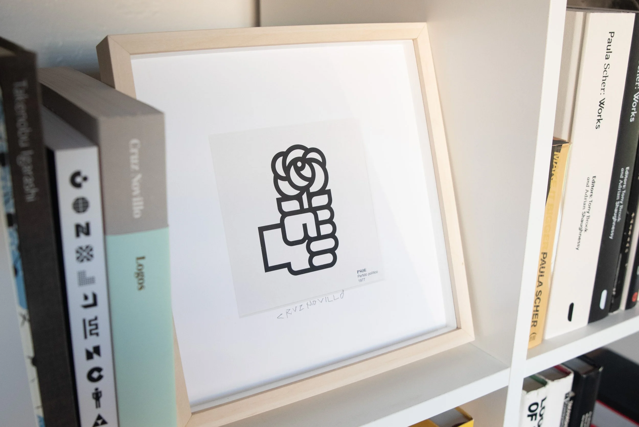
A signed print of Cruz Novillo’s iconic 1977 PSOE fist-and-rose symbol displayed on my bookshelf.
Novillo was born in central Spain in 1936, the year the Spanish Civil War began. He first studied law before moving into advertising as a cartoonist, then industrial design, and eventually graphic design or what was more commonly known at the time as commercial art.
A young Cruz Novillo photographed alongside one of his early graphic works. Courtesy of Counter Print.
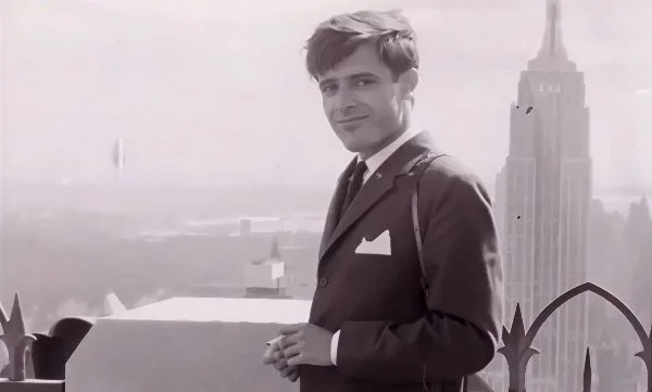
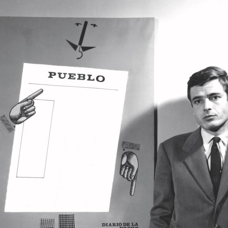
Cruz Novillo during a visit to New York in the early years of his design career. Image Credit: altafidelidad.org
I first became aware of Novillo’s work in 2017, when Counter-Print published the first major monograph dedicated to his work. Titled Cruz Novillo: Logos, the book presents a comprehensive overview of the identities he designed throughout his more than 50-year career.
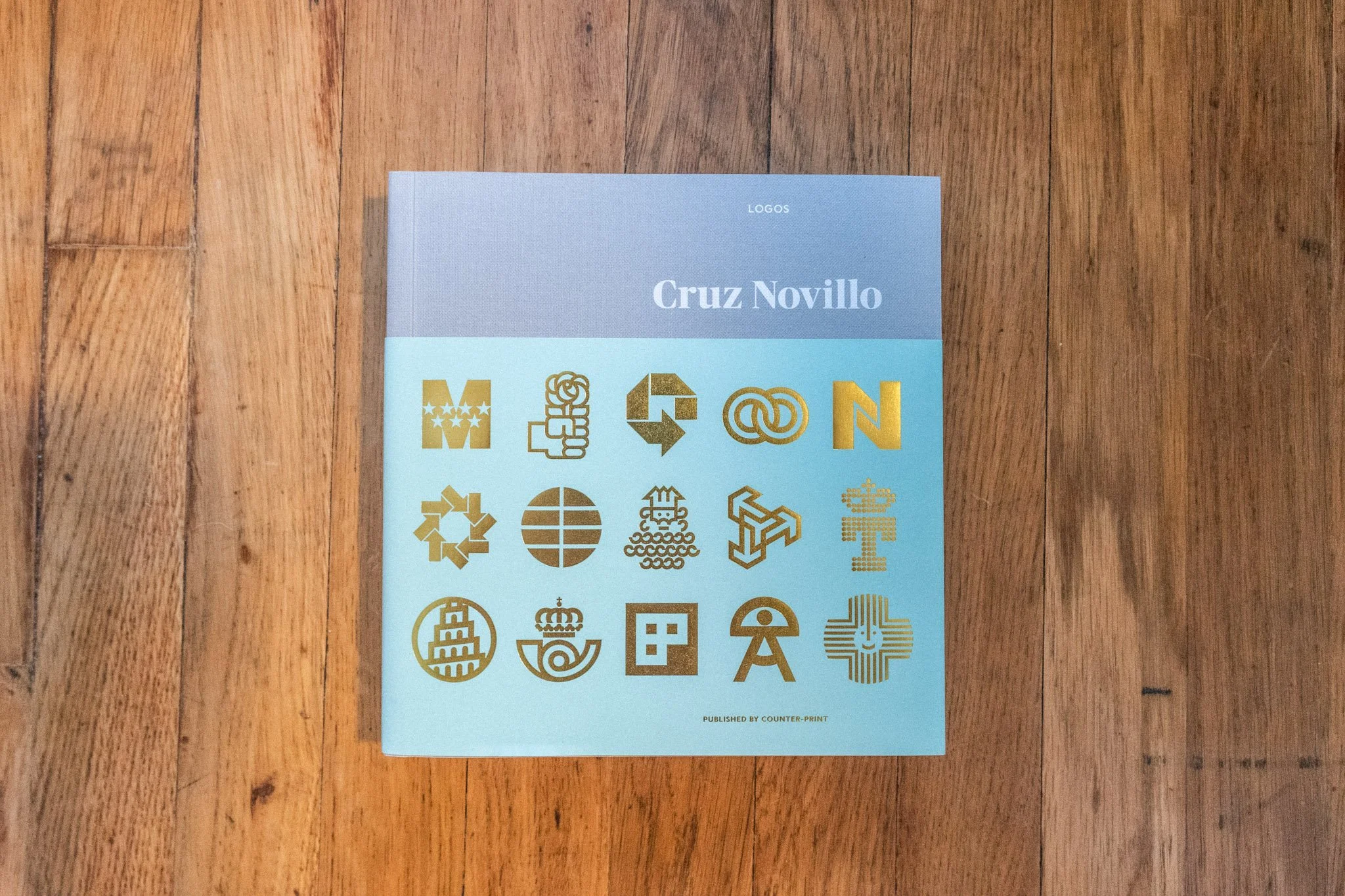
Really nice use of gold foil on the belly band for Cruz Novillo: Logos.
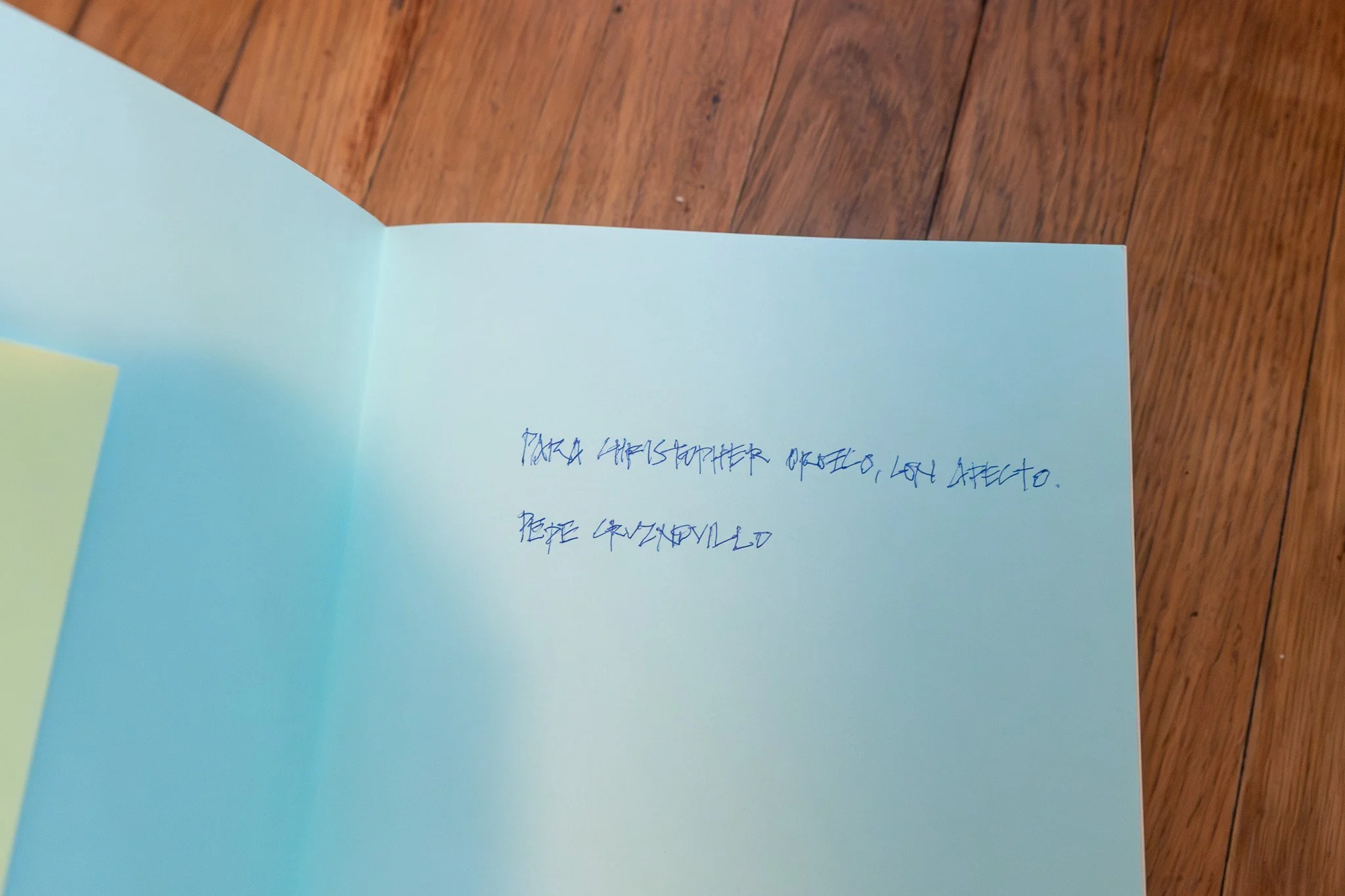
A handwritten inscription from Cruz Novillo inside my copy of the book. The note translates to “For Christopher Orozco, with affection.” His older age is evident in the shakier quality of the signature.
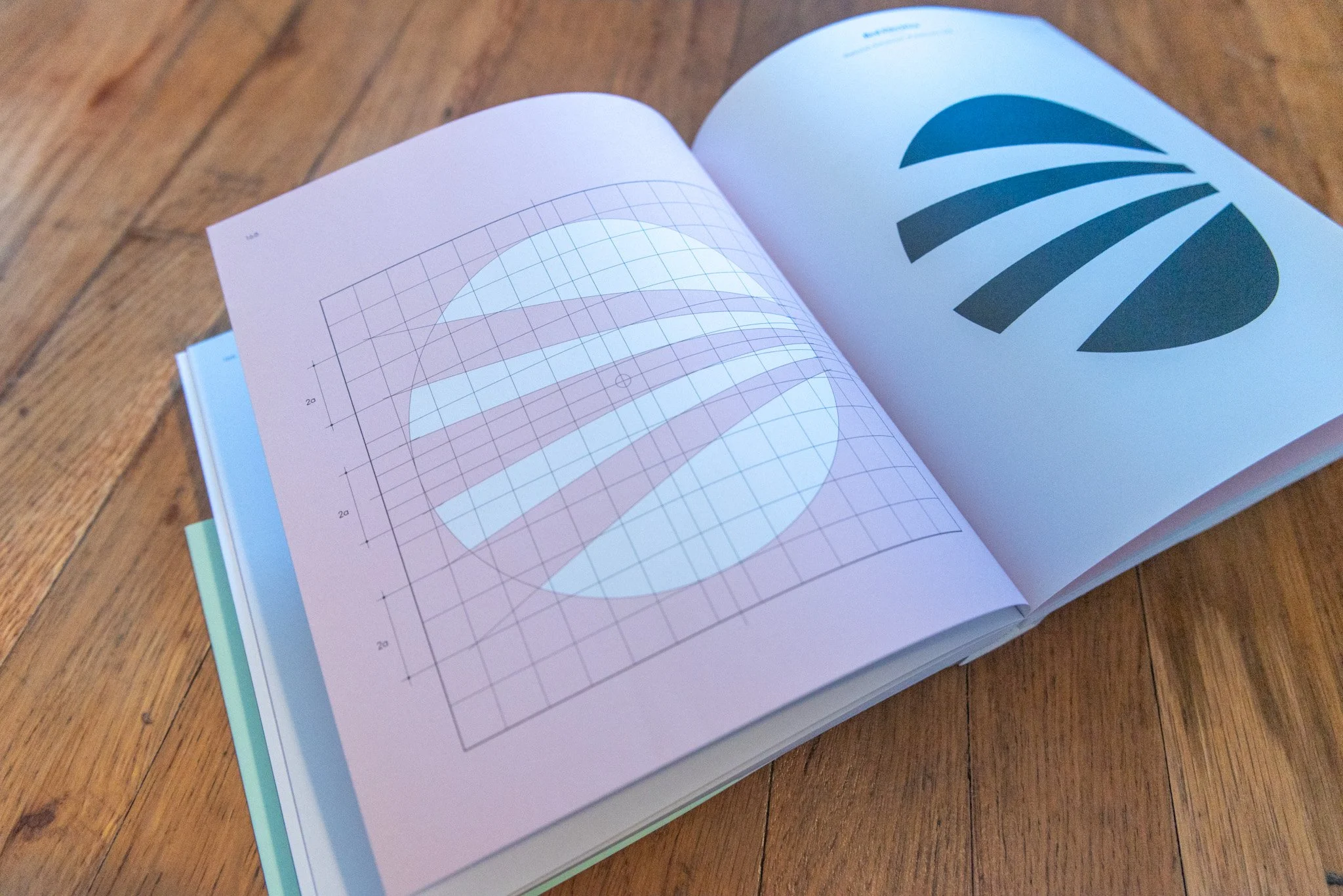
A spread from Cruz Novillo: Logos highlighting the designer’s use of precise geometry and carefully constructed grids to create clear, timeless visual identities. Logo for Red Electrica. 1987.
Many of his logos were built using careful geometry and grids, giving them a strong sense of balance and clarity. Even decades later, the marks still feel modern and timeless.


Novillo not only worked in two dimensions, but explored sculpture as well, bringing the same geometric precision from his logos into physical form. He later expanded on these ideas in his Domestika course on three-dimensional corporate identity.
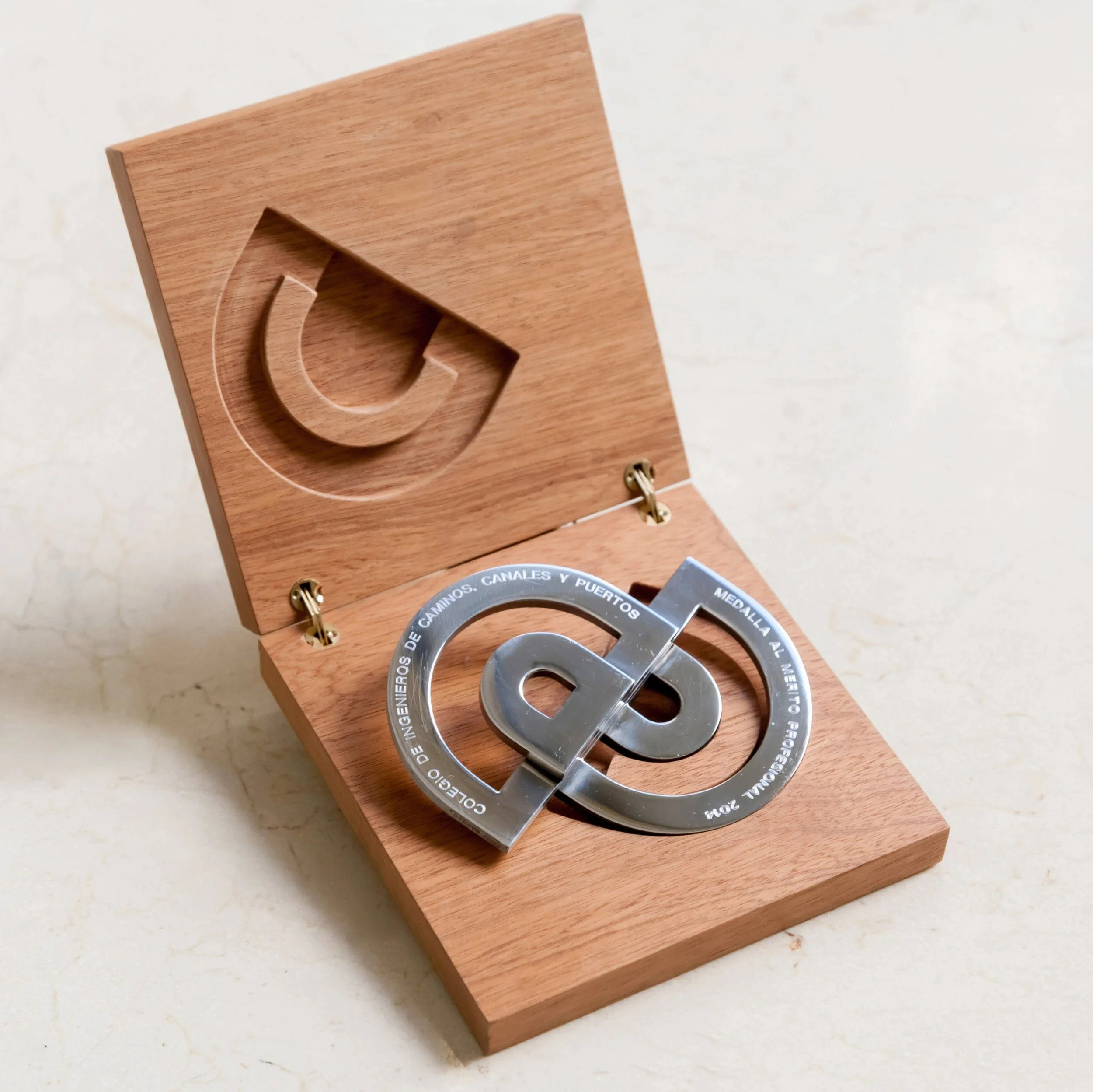
A commemorative piece designed by José María Cruz Novillo for the Colegio de Ingenieros de Caminos, Canales y Puertos. Image courtesy of Cruz más Cruz.
In his later years, he founded Cruz más Cruz alongside his son, Pepe Cruz Novillo Jr., a Madrid-based design and architecture studio. Working together allowed father and son to bridge generations of Spanish design.
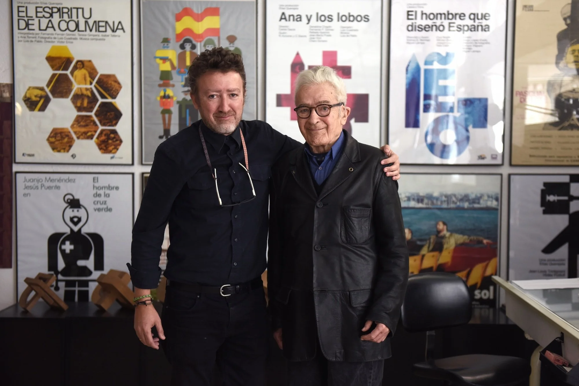
Cruz Novillo with his son, Pepe Cruz Novillo Jr., in their studio, standing in front of a wall of film posters designed by Cruz Novillo. Image courtesy of Domestika.
The studio’s identity I find super clever in how they use the same cross symbol for both the surname “Cruz” (cross) and the word “más” (plus).
Cruz Novillo has become more widely recognized in recent years thanks in large part to the efforts of his son, Pepe Cruz Jr., who helped introduce his father’s work to new audiences both within and beyond Spain. In doing so, he helped ensure that one of Spain’s most influential designers would continue inspiring future creatives for years to come.
You can learn more about Cruz Novillo and his work in the documentary El Hombre que Diseñó España, which explores his life, process, and lasting impact on Spain’s visual culture.